
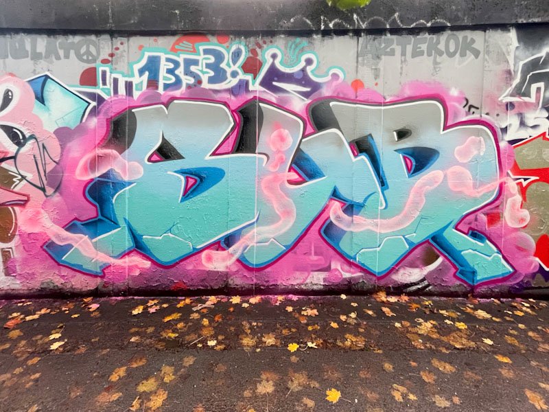
Sub’s improvement over the last couple of years is marked, and his persistence admirable. He paints regularly and in lots of different spots, constantly refining his technique and turning out some distinctive pieces.
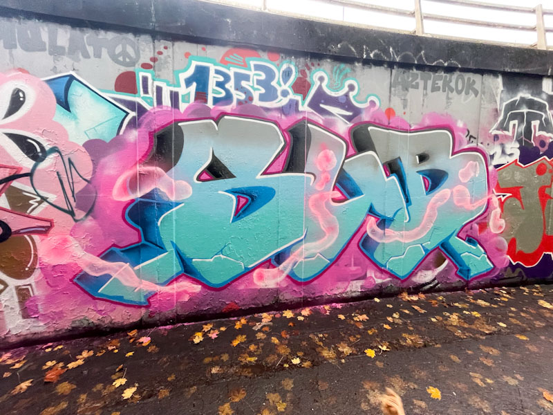
In this piece, his blended fill is really well done, transitioning seamlessly from grey to turquoise. He has also managed to achieve a fascinating cloudy pink line running through his letters, a great effect. I think that these letters have slightly softer edges than some of his previous pieces, and it is a good look. Clean, tidy with interesting ideas… what’s not to like?
