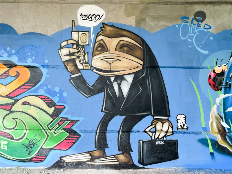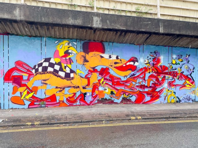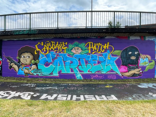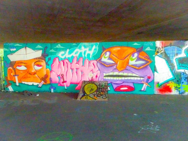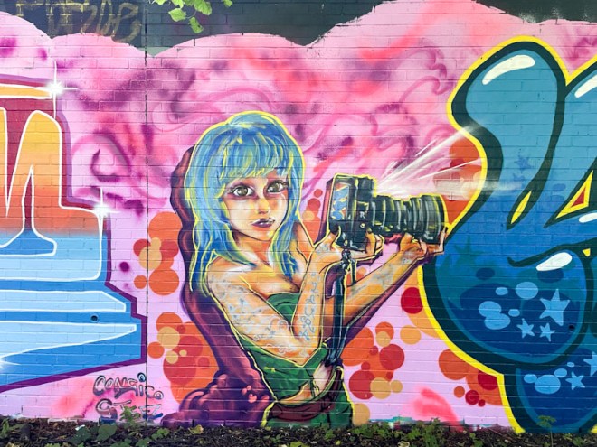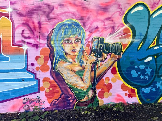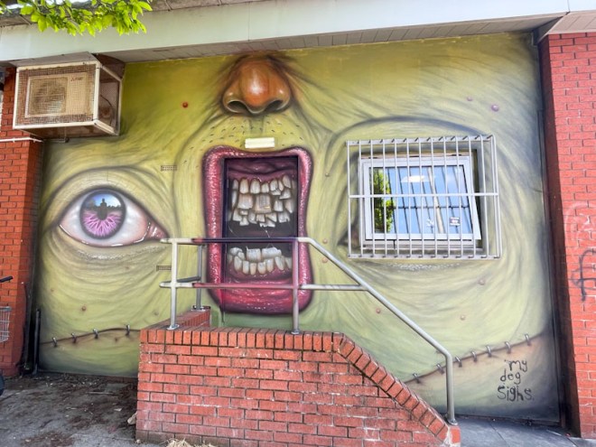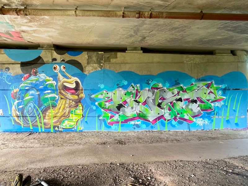
I was very happy to catch up with Sled One as he was finishing off his snail, way back in April – a piece that nearly slipped through the net. Happy, because I hadn’t seen him for a long while, which was perhaps not too surprising because he told me that he was a bit of a ‘fair weather’ artist with regard to his street work. Here he teamed up with Oust, amongst others is an outstanding collaborative wall under Brunel Way.
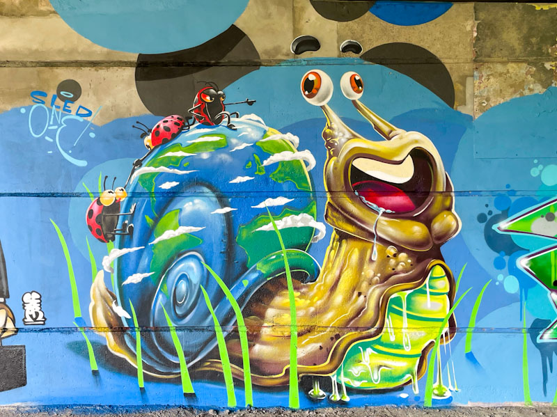
The Snail is so full of character and a multitude of charming details – his face with those eyes on stalks is a picture. Three cheeky ladybirds are hitching a ride on the snail’s back and his shell is a clever representation of planet Earth. The snail is sliding his way through the grass.
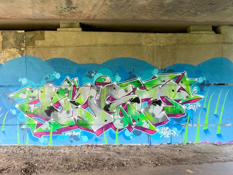
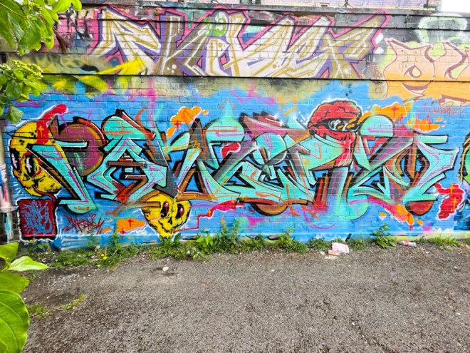
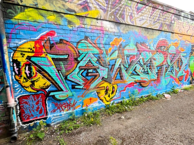
Next to the snail set in a grassy landscape is a wonderful piece of graffiti writing from Oust. The letters and drop shadow pick up on and reflect the colours used in Sled One’s adjacent snail. The wildstyle writing is beautifully presented with organically blended colours in the letters, with some spots, and a blue background with further spot decorations. This is a superb pairing from the overall collaboration.