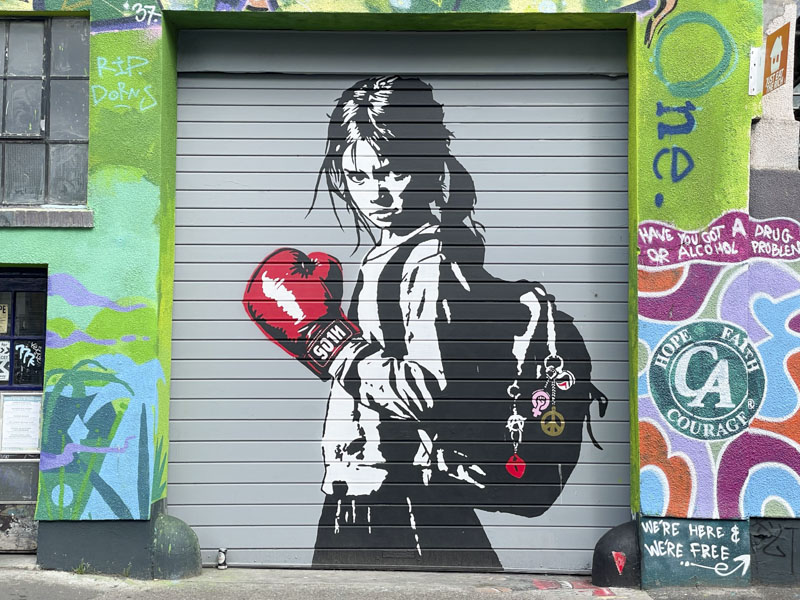
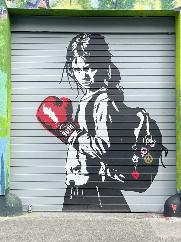
I had been tipped-off that Goin, who had been in Bristol for Upfest, was going to paint this wonderful ‘extre’ piece in Jamaica Street, but had been told the wrong day, so when I turned up he was nowhere to be seen. When I returned a few days later, here it was in all its glory.
Goin, Jamaica Street, Bristol, July 2026
The theme of this greyscale stencil was similar to one he painted for Upfest 2024, in which a young girl defends herself from bullying and danger and through the obvious power the red boxing gloves bestow upon her. The piece is both moving and rebellious, and crafted brilliantly by the French artist.
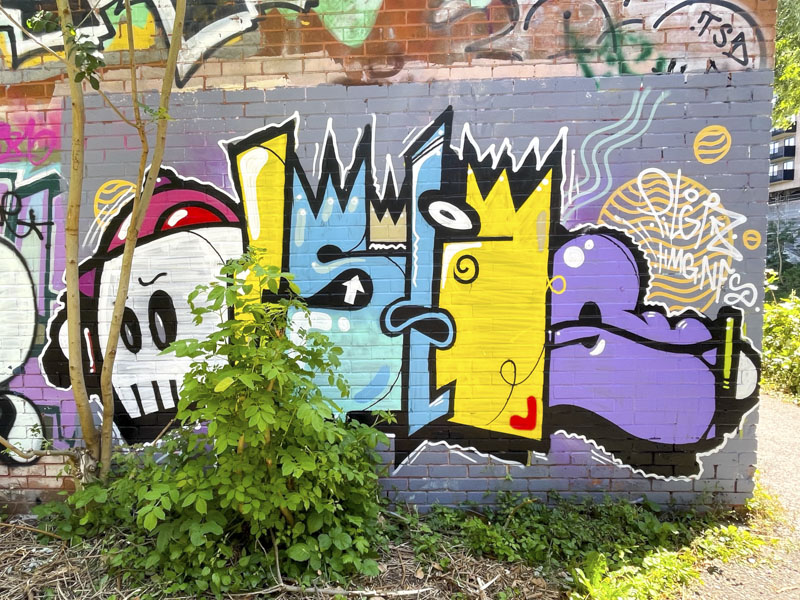
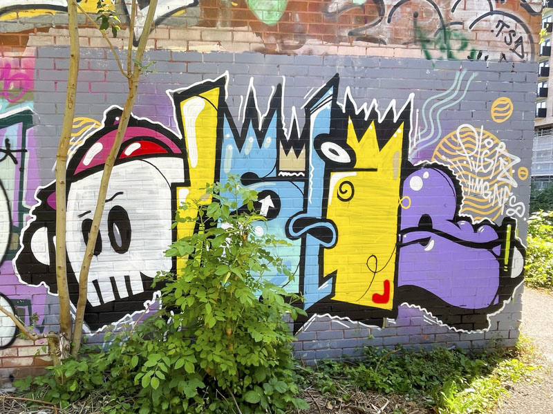
This wall has been in need of a tidy up for quite a while, and Dirtygypo has risen to the challenge with this delightfully colourful piece. Once again, I struggle to read his writing, but I think I can read a couple of Ss, or it might say something as simple as ‘stop’.
Dirtygypo, River Avon, Bristol, July 2026
Each letter has been assigned a different colour and the whole thing starts off with his trademark skull, which is beautifully finished. This fine piece joined a couple of others that have been painted by the artist in this spot recently. Nicely done.
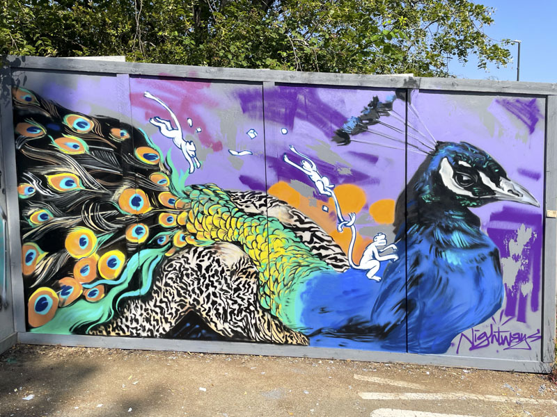
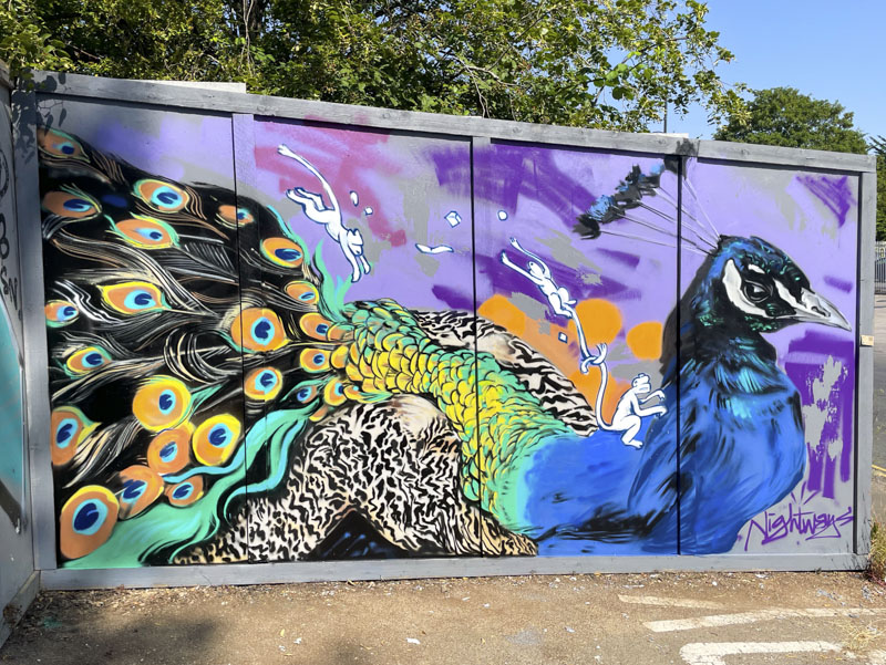
Today’s post is significant for two reasons. Firstly it marks the welcome return of Nightwayss to Bristol after a couple of years spent away from the city, and secondly, it was his post on Instagram that alerted me to the three long hoardings in Fishponds of which this is one. The magnificent piece reminds me of what we have been missing during the artist’s absence.
Nightwayss, Filwood Road, Bristol, July 2026
A peacock in all its splendour is joined by three signature monkeys (I have missed the monkeys) that appear in most of Nightwayss’ work. The peacock is a fabulous bird to paint because of its iconic feathers and colouring, but it is the head with the little crown feathers that wins the day for me. I sincerely hope that this is the first of many new works by Nightwayss, who has been much missed in the city.
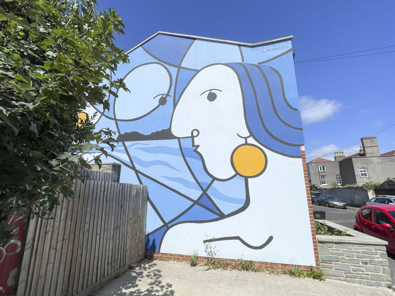
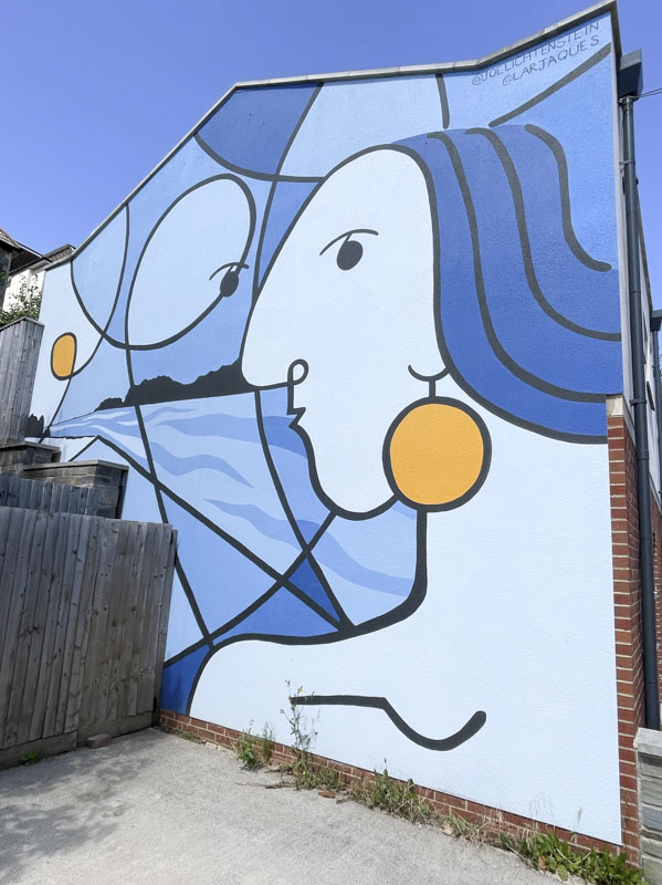
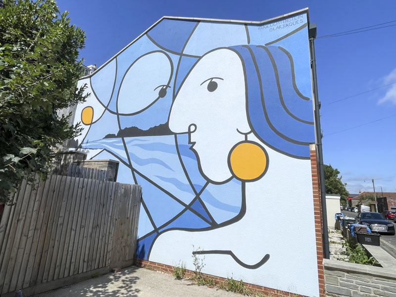
Joe Lichtenstein and Larjaques, St Andrew’s Road, Bristol, July 2026
Being curious really pays off when wandering around looking for street art, or admiring architecture and urban spaces. A few weeks ago I took a walk in the Montpelier area of Bristol, I had a little bit of time to kill while waiting for my son’s work clothes to wash in the local launderette (don’t ask – a long story), and was rewarded with this magnificent mural by Joe Lichtenstein and Larjaques.
Joe Lichtenstein and Larjaques, St Andrew’s Road, Bristol, July 2026
I got lucky with the weather too, although to be honest it has been unbroken sunshine in Bristol for at least three weeks now, with the stunning blue sky matching up with that in the mural. The atmosphere conjured up by this stylised mural is one of a coastal scene being enjoyed by one (or two) observer.
Joe Lichtenstein and Larjaques, St Andrew’s Road, Bristol, July 2026
I love the way the sea and sky are delineated with the silhouetted promontory. The stylised portrait reminds me a little of Morag’s work, where single lines do a lot of heavy lifting. I know little of the artists and will need to do more research. What a wonderful statement to have on the side of your house. I expect the occupants are thrilled, and the mural certainly brightens things up. Bravo!
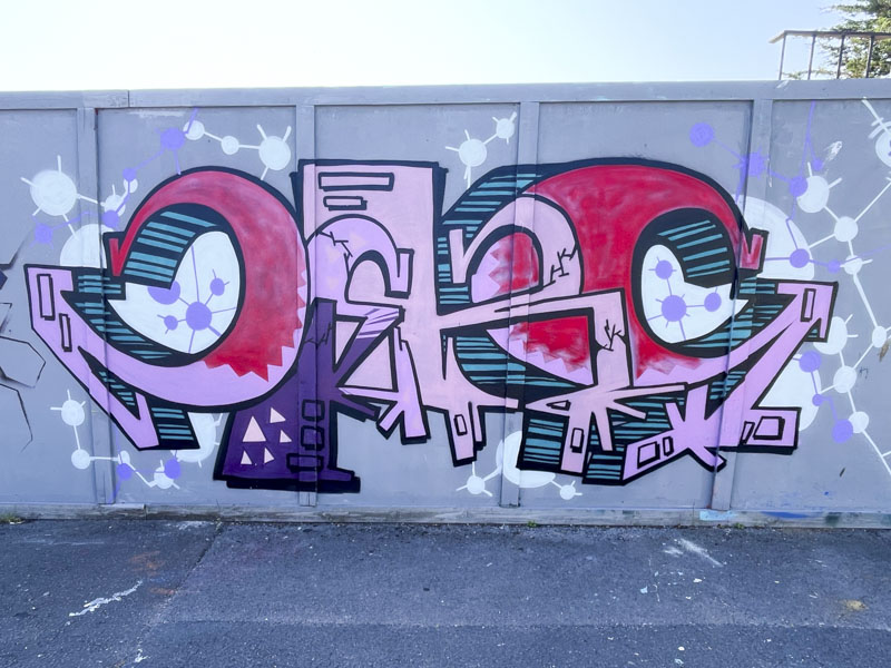
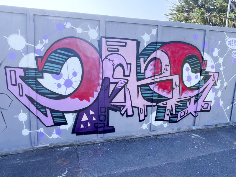
Zeks, Goodneston Road, Bristol, July 2026, Goodneston Road, Bristol, July 2026
Expect a torrent of pieces from the three hoardings in Fishponds that I recently discovered – there are so many great pieces there, adding to my already ridiculous backlog. This is a beauty from Zeks, who has a unique style, in which the unpainted space does a lot of his talking, although in this piece his lettering is larger than usual.
Zeks, Goodneston Road, Bristol, July 2026
The letters spell ZEKS and although quite neat and tidy, don’t really conform to any particular regular font or size, putting his work into the category of anti-style. His colour palette of reds, pinks and purples is a good one, and the letters are augmented with a ball and stick design around the piece, looking like a molecular model. All good stuff.
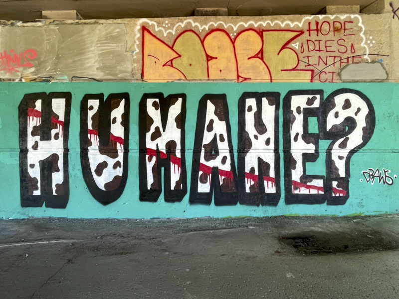
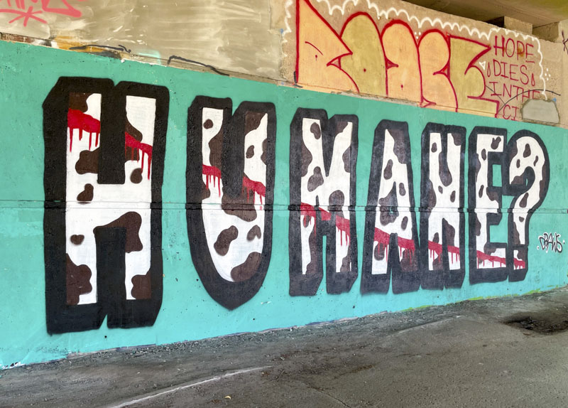
Mr Draws is an artist with a conscience and once in a while his activist streak comes out, in particular when it comes to cows, their welfare and, I guess, the eating of them. One doesn’t need to be a vegan or vegetarian to support his views, especially around the custodianship of livestock.
Mr Draws, Brunel Way, Bristol, July 2026
In this stark piece, Mr Draws has painted the word ‘Humane?’ with a cow hide pattern (although with spots like that it is most likely a dairy cow), and a bleeding cut sliced through the letters. The message is loud and clear, and I applaud Mr Draws for bringing animal rights/welfare issues to our walls. Protest and activism is one of the vibrant strands of graffiti and street art and pretty much always has been.
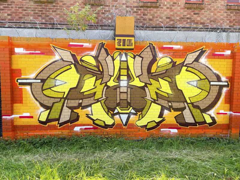
I am so pleased to be able to post this piece by 210. Pleased because I have many of his pieces in my archive, but until recently didn’t know his name. Now I have to go back and dig some of his other works out, because to my eye this is fantastic. The artist can often be found painting alongside, ARSA, RBN One and Mesk. I don’t know much more about him yet, but will try to find out.
210, Peel Street Green, Bristol, July 2026
The bilaterally symmetrical piece is so easy on the eye. Although the pattern is quite complex, there is a softness and clarity to it that steers clear of being ‘too clever for its own good’ which some technical pieces can be at risk of falling into. The colour selection works exceptionally well, even if they aren’t my favourites. A really classy piece by 210. Watch this space as I attempt to unlock some more from my archives.
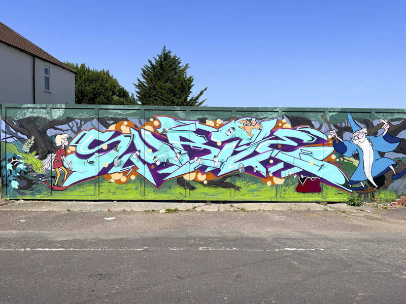
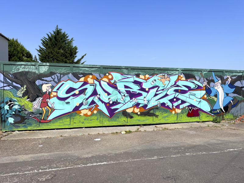
As mentioned in my previous post, I have recently discovered a treasure chest of hoardings in the Fishponds area of Bristol, and can’t quite believe that it has taken me so long to find them. I have also managed to track down countless Subtle pieces that I have been aware of, because they are here too. This feels like an enormous weight lifted from my shoulders, as it has been bugging me that I couldn’t find them.
Subtle, Enfield Road, Bristol, July 2026
This is a wonderful combination piece by Subtle, with his characteristic letters intertwined with characters and scenes from Disney’s ‘Sword in the Stone’ film. The background woodland scenery is truly brilliant and is such an amazing backdrop to his letters. Several more pieces by the artist to come from this honeypot spot.