.
Moonlight corrupted
while street light luminescence
bounces off the clouds
.
by Scooj
.
Moonlight corrupted
while street light luminescence
bounces off the clouds
.
by Scooj

There were so many exceptional pieces painted for the ‘Burberry check’ themed paint jam down at Sparke Evans Park, and in the main they were of the highest quality. I might be pushing the boat out here a bit, but this might be one of the best pieces I have seen by Bnie altogether.

Her distinctive letters have been given the Burberry treatment, but it is not only the familiar check patterns that are stunningly presented, but the 3D drop shadow and border are so neat and tidy too. The whole thing is set on a dark blue wall with some cloudy wisps around the edges which help the writing to pop out a bit from the wall. Absolutely stunning work from Bnie.
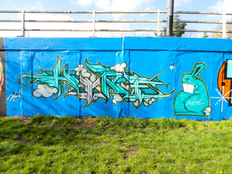
I was lucky enough to run into Hire and Cort when they were painting alongside each other on a rather lovely afternoon a week or two back. You don’t often get to see Hire’s work on this roundabout wall, so it was a pleasant surprise to see him painting there.

As I would always expect, his piece oozes quality and class. Set on a wonderful blue background, Hire has spelled out HIRE and added a wonderful angry bunny accompaniment. Just in passing, this photograph illustrates the weight of decades of paint that has been plastered on this wall and which ripples and bubbles – at some point large chunks of paint will tumble off the wall under its own weight.
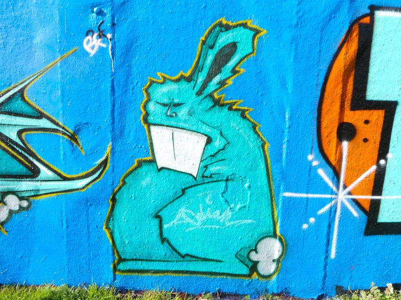
The letters are outstanding, and their uniformity of design is touching on calligraffiti. Little puffy clouds are intertwined with the letters. Of course, Hire has given us the extra light of a bunny, that is like a mega-tag for the artist.

Conrico paints an awful lot of commissions on shutters and shop fronts, and this is a recent one opposite the M32 Spot in Easton. I don’t know how he gets his commissions, but he is either very persuasive or his ‘brand’ is recognised in the area and he gets work through word of mouth. Probably a blend of the two.

I don’t think that this is Conrico at his best, and that sometimes working to a brief can be a bit limiting, but it is nonetheless an interesting foodie triptych. Painted on the shutters of Desi Eats, an establishment I haven’t visited, is a selection of fast food, burgers and chips, alongside an oversize stylised knife and fork.

The second shutter has more fast food and a little delivery van, a bit like a tuk tuk. I am guessing that Desi Eats also deliver. I am not too sure about the ‘health and wealth’ claim on the outside, but maybe there is a more healthy selection of food available. A fun and rather different piece from Conrico.
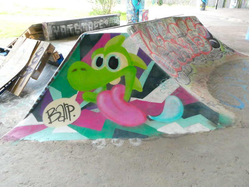
This is a cheeky little piece by Enn Kay, on a small ramp at the southern end of the Daveside DIY skate park. Somehow Enn Kay manages to create a really soft finish to some of his pieces, and I don’t know how he does it. Maybe it is the pastel colours or his shading skills.

I have a feeling that the monster character was painted on a pre-existing abstract piece, although it is possible that Enn Kay painted the background as well, but it doesn’t really fit with his style. It is always good to see his monster pieces about the place. Barp!
.
Undeveloped block
space for people and nature
urban oasis
.
by Scooj

This stunner by Mena, writing MENAS, is her contribution to the recent Burberry’s themed paint jam, recently held in Sparke Evans Park. It is a clever theme, with each artist incorporating the Burberry check in their own way. It is interesting how a household brand is so instantly recognisable, even if it isn’t necessarily presented in the form that we are used to seeing.
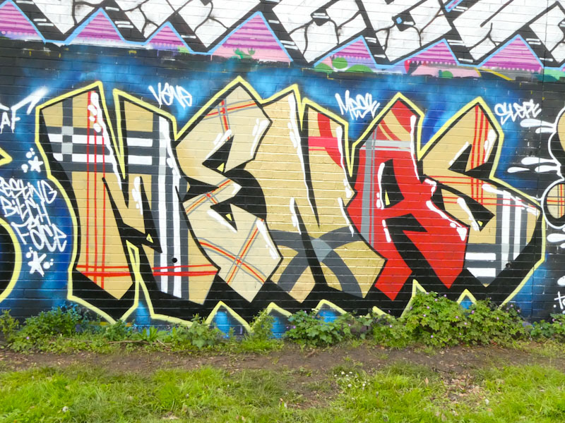
This is a real quality piece of writing from Mena, whose work is probably underrepresented on Natural Adventures. It might even be the best that I have seen from her. Perfect colours, complex checks and a sound 3D drop-shadow and border combine to make this a most enjoyable piece. A couple more and I will have enough for a gallery.
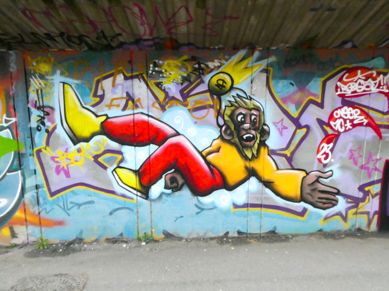
When I first found this falling monkey on the M32 Cycle path, I was left pondering whom it was painted by, and although it was signed, I didn’t have enough to go on to be able to post the piece at that time. It is by Bean, who has been making a bit of an impact this April, hitting the walls of Bristol pretty hard.

Bean has painted several different characters and certainly has a versatile approach and creative imagination. I am a big fan of monkeys in street art, and since Nightwayss left us, there has been a shortage of simian artwork, so it was good to find this piece. I am expecting great things from Bean this year, if April is anything to go by.
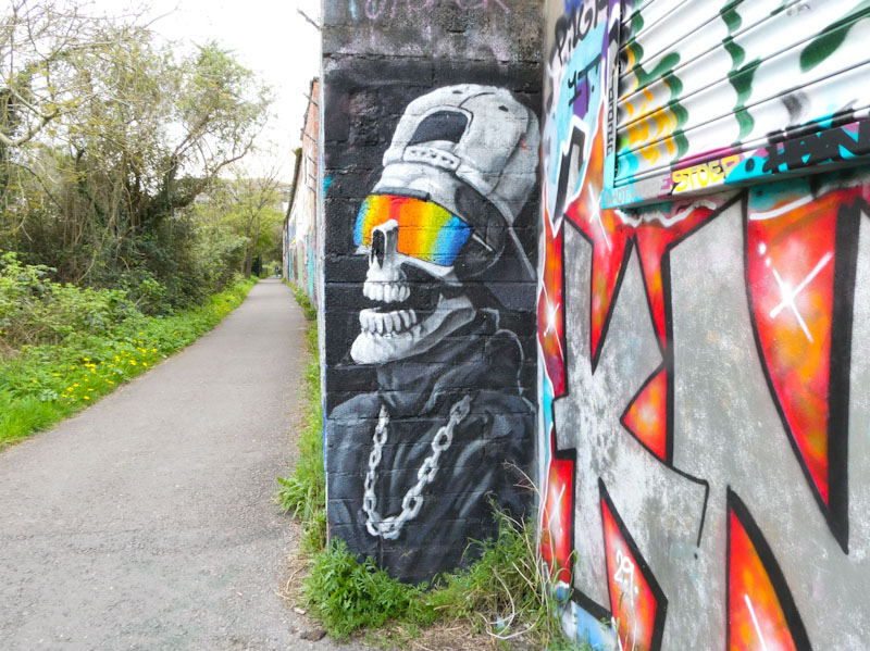
Laic217 has awoken from a little bit of a winter slumber, and what a joy it is to see his work appearing on the streets again. I must have found this one pretty quickly after he had painted it, because I hadn’t seen it on any social media when I stumbled across it.
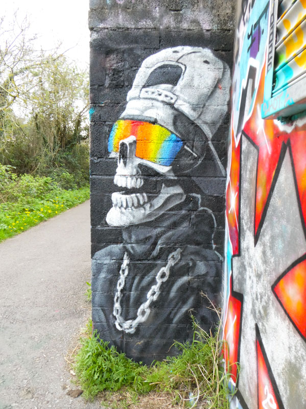
This piece demonstrates the impact of colours against greyscale. We see one of Laic217’s skeleton characters complete with textured clothes, a neck chain and baseball cap all painted in black, greys and white. The portrait piece is brought alive with the addition of rainbow colours on the character’s lightweight sunglasses, changing the whole dynamic of the piece – imagine how it would look without the splash of colour. Clever work from Laic217.
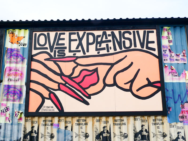
Following on immediately from the previous post featuring Katie Fishlock, here is a piece that she painted, in collaboration with Fyona Finn back in April 2022, a year ago. Once again we see a bold statement accompanied by a carefully crafted illustration.

Fishlock’s style seems to be very much about the message and arresting imageryto help drive it home. Some clever wordplay is at work here and the phrase can be read as ‘Love is expansive’ or a rather more pessimistic version ‘Love is expensive’. I suspect both are true statements, and that is the point. I don’t know which artist did which bit of this piece, but as a collaboration it works perfectly. Maybe we’ll have another chapter in April 2024.


