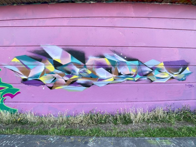
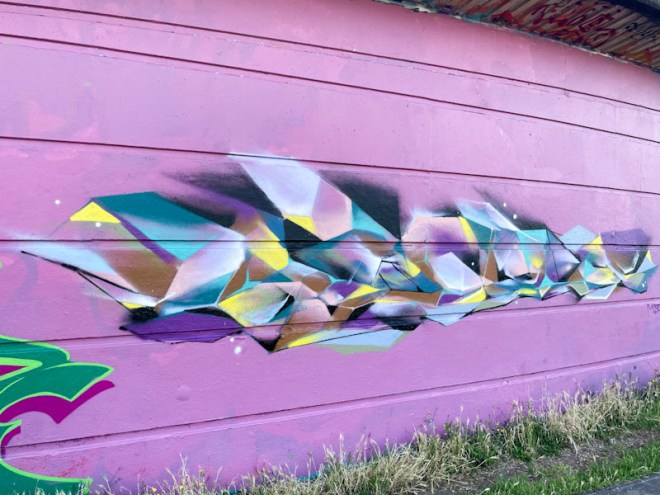
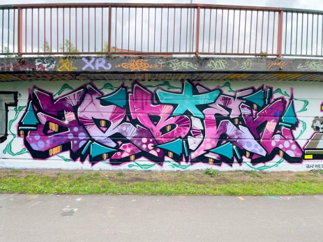
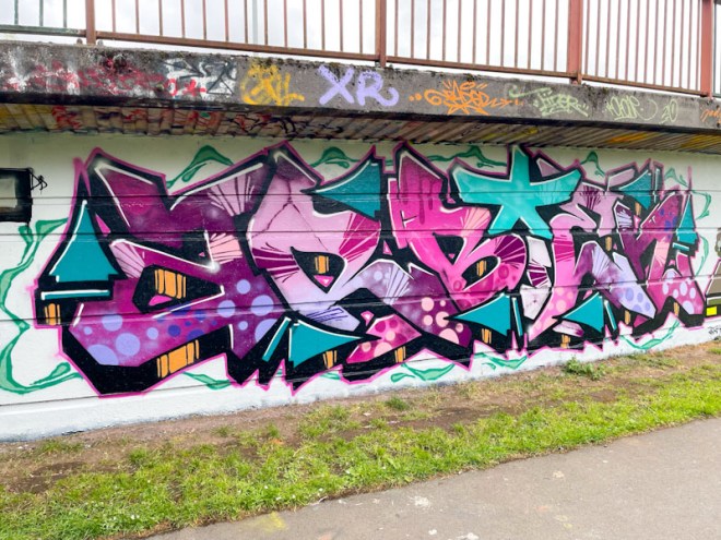
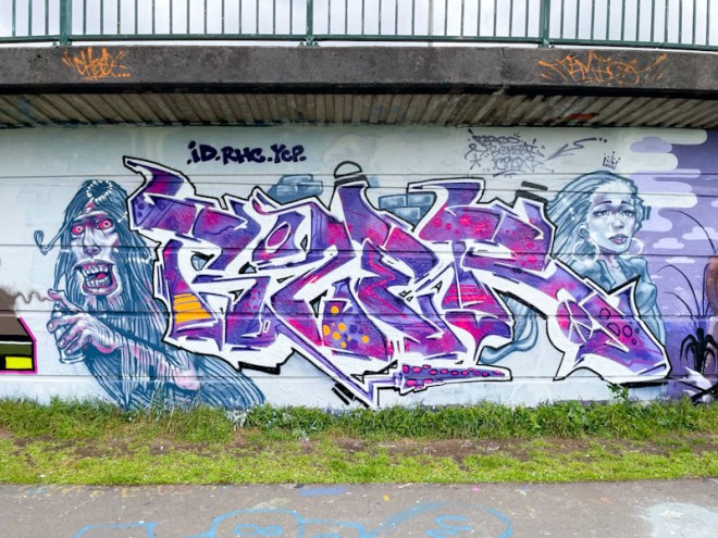
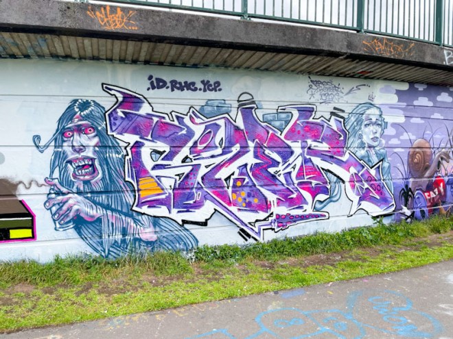
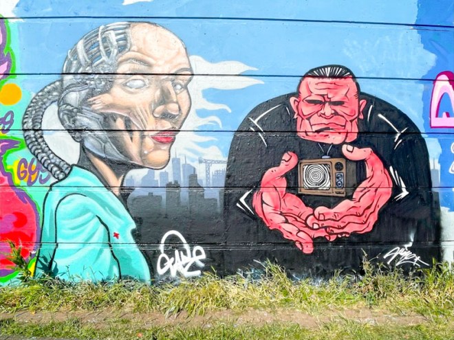
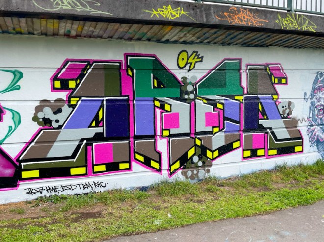
I’m not sure what the occasion was, but it doesn’t really matter when three such accomplished artists come together. The triptych combination collaboration is by Turoe on the left, Jody in the middle and Fade on the right.
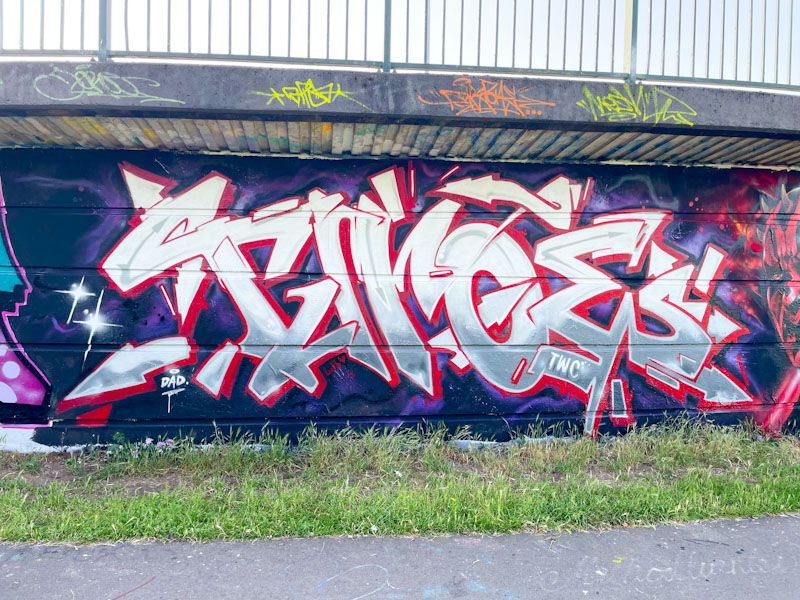
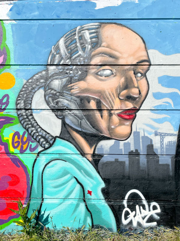
Turoe has been a little more active of late which is great to see, and it might signal an improvement in his health which I understand has been a challenge for him in recent years. This is a gorgeous piece of graffiti writing, which with its white and grey fill, gives the impression of being reflective chrome or other metal. A decent red drop shadow lifts the letters above the dark velvety purple background.
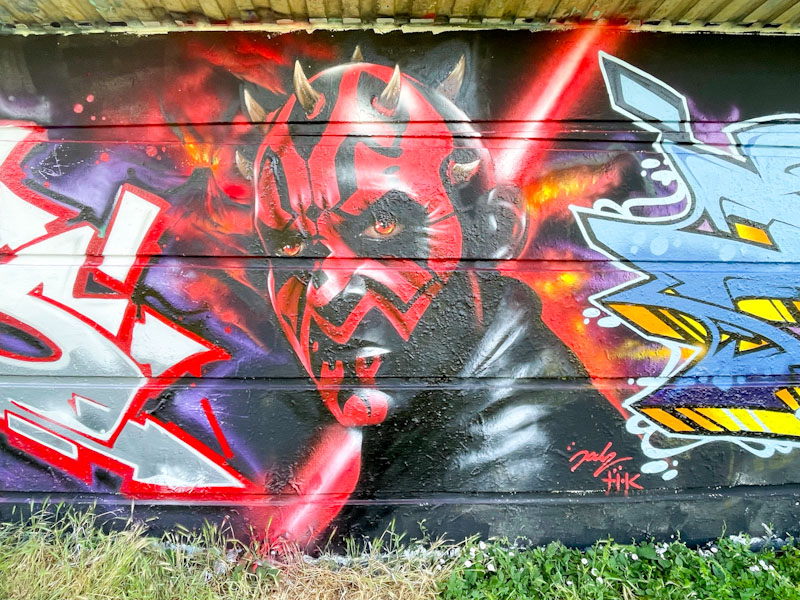
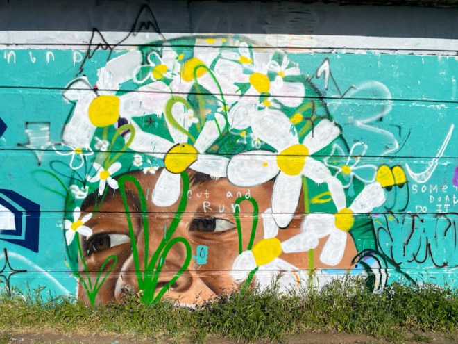
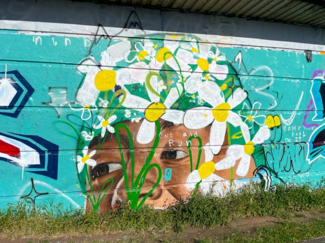
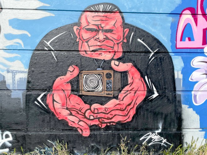
Any reference to Star Wars is always welcome on these pages and this outstanding portrait of Darth Maul by Jody is top drawer stuff. (note to self – prepare a Star Wars gallery). Jody has captured the character perfectly and manages to convey his attitude and menace. The background of the planet Mustafar works well with Darth Maul’s lightsabre

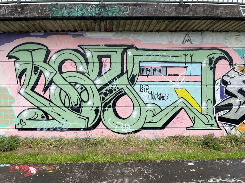
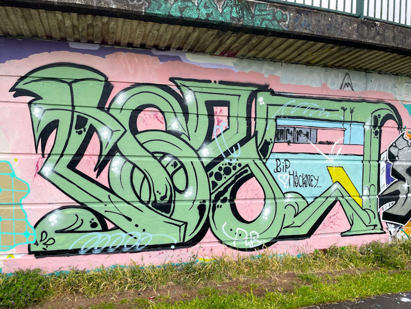
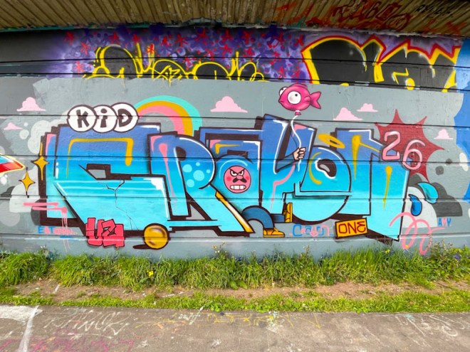
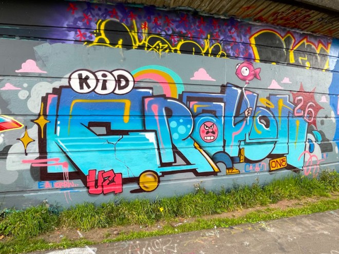
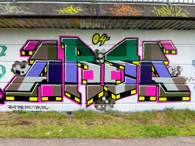
Fade had a quiet winter, but now that the weather is fine (almost too fine) he has been out and about more frequently. This classy bit of wildstyle graffiti writing is vibrant and full of movement augmented by the squiggly border. Some nice transitions in the fills with reversed bubbles appears to have been applied with such ease. None of this is easy, and these three artists are at the top of their game.