
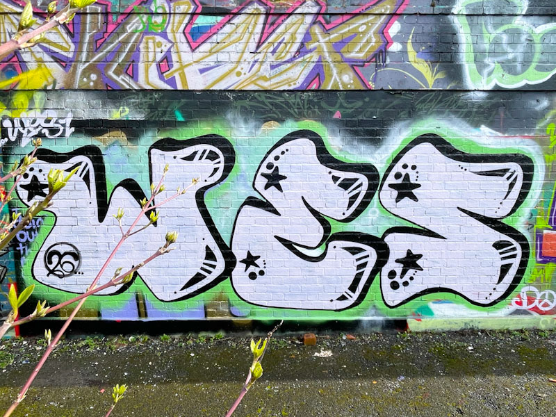
It was so predictable that in the days after first meeting Wes up at Greenbank, I would start to see his work all over the place, and that is exactly what happened. I can’t believe I had this blind spot, but it happens from time to time. I will, however be seeking to make amends from this point in time, and include his pieces when I can.
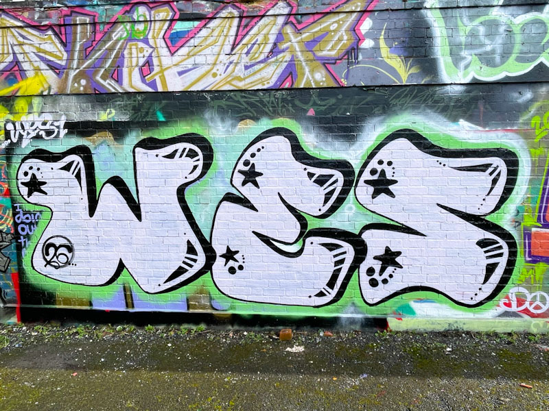
You might think that having fewer letters makes things simple, but by design, the letters will be bigger, and so fills need to be more considered. While there is a lot of ‘white space’ in these letters from Wes, he has managed to add in enough decoration to keep things interesting. The letters with a tiny overlap appear to float over a greeny-blue base. Watch out for a lot more from Wes.
