When I first saw this piece I thought it might have been by Mudra, mainly because of the bright colours and capped character, but I couldn’t find his recognisable signature anywhere, so I had to think again. It is in fact by Dit Oner, whose range of styles is to be admired.
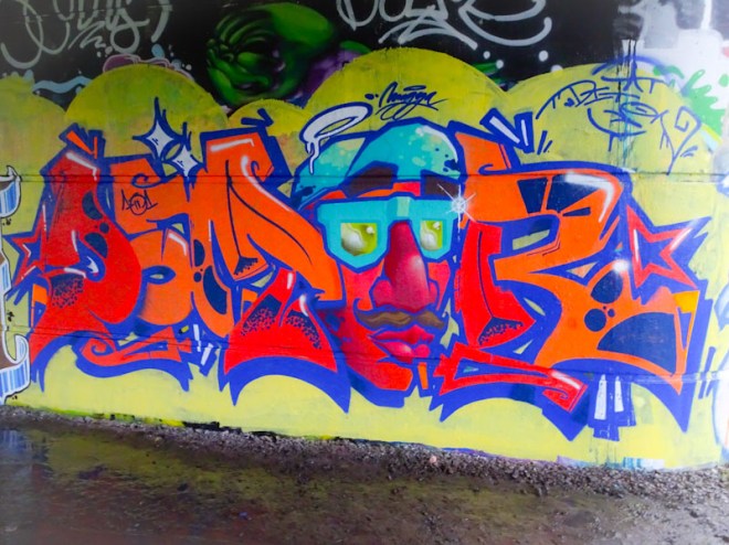
This is a writing-character piece with the character being incorporated as one of the letters. The letters are beautifully designed and filled and the little white highlights help with the 3D effect. The character too is very nicely done and integrated into the writing. I have my doubts however about the yellow background. it simply doesn’t work for me, just a bit yucky and insipid. perhaps a darker colour might have worked better. Nonetheless a fine piece of writing from the Spaniard.

First thing I thought before reading your text – was this is nice and bright! 😀
LikeLike
This is actually a collab piece with the letters by Mascachapas (Dit Oner) and the character by Dabuten Tronko . . .
LikeLiked by 1 person
As ever, thank you.
LikeLiked by 1 person