
Another piece in Turoe’s ‘shyte’ series, this time in yellows and oranges, and a slight variation in spelling. As a reminder, this series began during the first lock down with the sentiment of it’s been a ‘shyte year’, and since then Turoe has stuck with the winning formula.
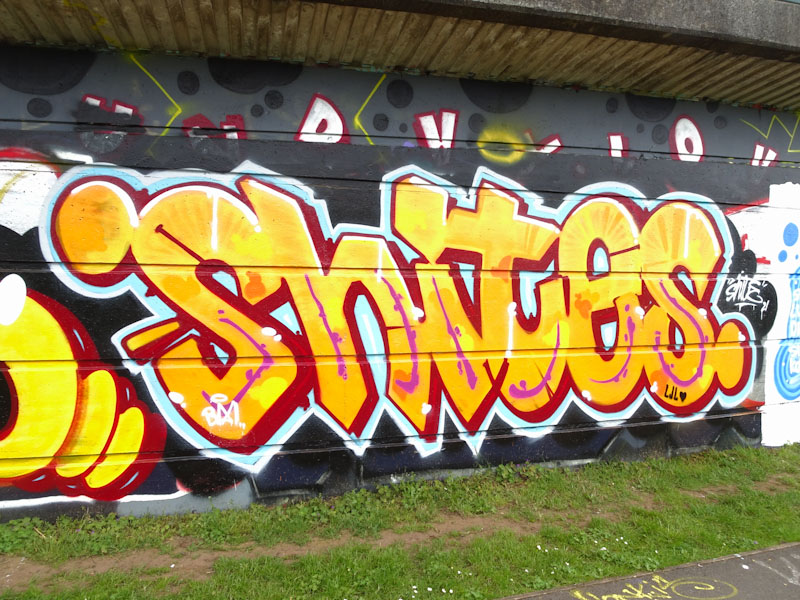
The letters are in a clear lower case font, beautifully finished with nice red 3D shadows and a blue and a white border. This is another tight piece from the prolific writer.
