
You will have gathered from the gallery I posted last week that I am enjoying the work of Mest at the moment. His aesthetically pleasing letters work well with graffiti writing and he constantly tries to switch up the fills and patterns in his fairly uniform and consistent letter shapes.
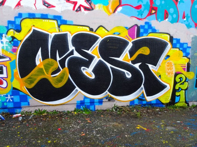
In this piece he has incorporated a little extra intrigue with some orange-yellow wisps drifting across the letters. From the look of it he might have been using the dregs of that colour, because the fill is neither solid nor is it cloudy, it is more the kind of fill you’d get on a quick throw up. Nonetheless it is a handsome piece.
