
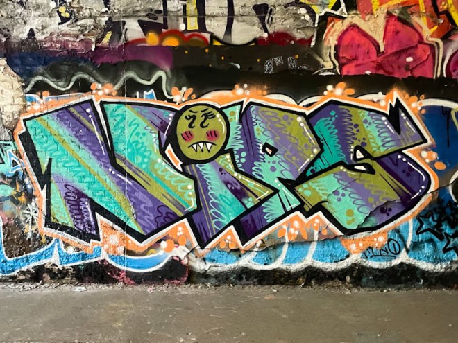
I have recently become aware of a few pieces appearing about the place by Nips. The eye-catching pieces are probably assisted in part by the choice of letters, which stand out, when compared to some of the illegible sub-standard stuff that clogs up our walls (although in fairness, everyone has to start somewhere).

Although this is the first piece by Nips to be features on Natural Adventures, it will not be the last, because there is something cheeky and different in the writing. The most notable element of this piece is the intricate patterning in the letter fills, together with a great colour palette. Also distinctive is the creative use of the dot on top of the ‘i’ (which I understand is called a tittle – no jokes about tittles and nips please). Great work from Nips.
