
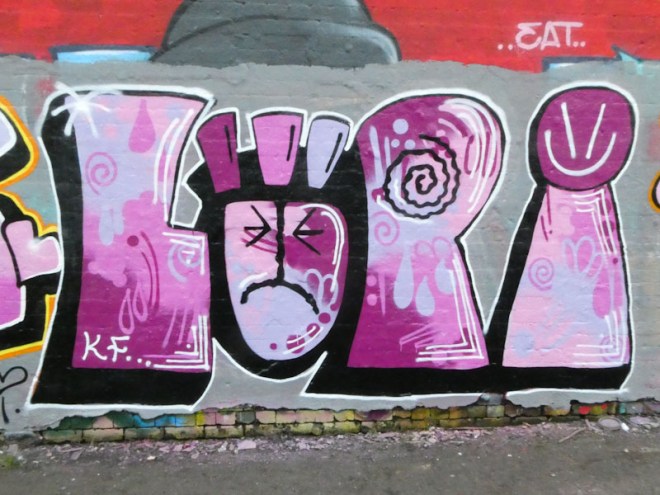
My rummage through my graffiti archives continues with this beauty from Lupa, painted last February. I have said before that I am attracted to her slightly crude style, which is definitely not to detract from it, but to distinguish it from some of the other writers who paint with knife-edge precision. There is room for all styles on the walls of Bristol.

Lupa’s letters are large and chunky, giving plenty of scope for creating interesting fills. In this case, she has used some lovely shades of purple and lilac which are carefully blended in several different ways, overlayed with some symbol decorations. Her trademark face in the ‘U’ is looking a little sad, and is joined with a simple smiley on top of the ‘A’. An attractive piece from a graffiti writer whose work definitely appeals to me.
