
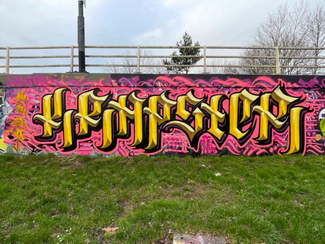
It was great to catch up with Stivs while he was painting this piece, and it gave me the opportunity to tell him how much I admired his incredible technical skills with creating these amazing calligraffiti letters. Stivs has made a deliberate choice to move back to writing words he used to write before writing Stivs, namely the word KRAP and variants of it. In this case he has written KRAPSTER.

The letters are not only beautifully crafted and proportioned, but they also incorporate four shades of yellow, one for each elevation, which together create the appearance of gold letters and a three-dimensional effect. The letters are set on a contrasting matrix of pink lines and squiggles, which rounds off the whole production nicely. Great piece by Stivs.

Not usually a fan of letters but those are cool
LikeLiked by 1 person