
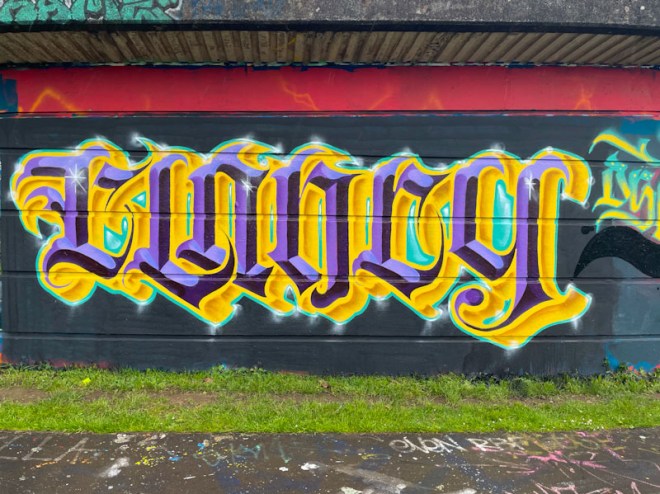
I don’t know who or what CLANCY is, but it makes for some fabulous calligraffiti by Stivs, who has been having something of a purple patch this spring. The colours that Stivs has chosen for this piece are rather regal and opulent, but also a little garish in a fairground kind of way, if that makes sense.
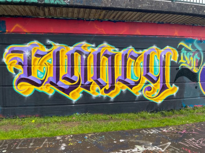
As ever his letters are beautifully crafted and have that regularity and discipline required for calligraffiti. There are three tones of purple used in the letters, each in the same orientation to create depth and a 3D effect, and this is offset by the yellow tones, looking like gold, for the drop shadow. This is a highly accomplished piece of writing from a master of the craft.

Outstanding! It is difficult enough to accomplish decent hand written calligraphy. I cannot begin to imagine the technique and skill required to pull it off as artwork on a wall!. Great sharing, Scooj.
LikeLiked by 1 person
Thank you.
LikeLiked by 1 person