
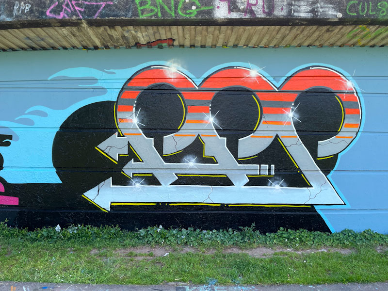
Marckinetic has been out a fair bit this year, painting alongside his mate Kid Krishna, and he hasn’t yet appeared to run out of inspiration for his FFS designs – this one being a cracking example. There is a real sense of clarity and purpose in this piece.

You have to have some insider knowledge or a great imagination to know that the letters spell FFS. There is a lovely symmetry and flow in this piece created by the curves of the letters, and the deep black shadow gives the whole thing a monolithic appearance. The fills are very nicely worked and I love the cracks in the blue fills. The piece has been nicely finished and is clean and crisp – an excellent and unusual piece of graffiti writing from Marckinetic.

One I need to go back and find as I don’t think I posted it at the time . . .
LikeLiked by 1 person