
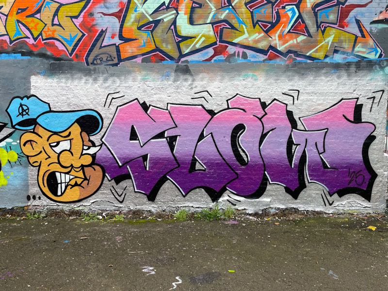
As if it were needed, this combination piece is further evidence that Jevoissoul is on an upward trajectory. Probably the most noticeable aspect of his improvement is the tightness of his work, and by that I mean his lines are clean and his fills tidy. When he first started out, His work felt a little cluttered and hurried, but I don’t get that feeling so much now.

To the left, our familiar character, complete with grimace, appears to be losing his cap, which creates a sense of movement in the piece. Jevoissoul’s artwork is becoming more sophisticated, with a two-tone light/shade aspect to the face. The letters also have a sense of movement, indicated by the black accent lines around the outside. Good colours and nicely blended horizontal strips fill the letters nicely. Perhaps there could be a little bit more interest in the letters themselves, but now I am just being picky.

His improvement is indeed evident and noticeable especially when looking back at his earlier work . . .
LikeLiked by 1 person
A gallery soon methinks.
LikeLiked by 1 person