
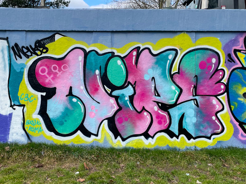
When I come across any pieces by Nips, I know I am I for a fill treat, it is pretty much a sure thing and I like that about her work. This one was painted in quick succession with another, I guess it was a painting weekend or something like that.

In this piece her customary NIPS letters are filled with a nicely blended palette of blue, turquoise, pink and red and some reversed out spots for a little bit of decoration. The white accent lines do their job well, creating a fine 3D effect. The selection of a yellow background contrasts well with the letters and brings focus to them. A sound piece from Nips.

Very nice piece. Thank you for a great start to the day.
LikeLiked by 1 person
As ever, a pleasure.
LikeLike