

I have a feeling that Short, like many other graffiti writers who stick to a general style of letter shapes and play with the colours and fills, will be making regular appearances in this blog. While this is only the second piece I have posted, I have plenty more in my files, and they seem to be coming at a steady rate.
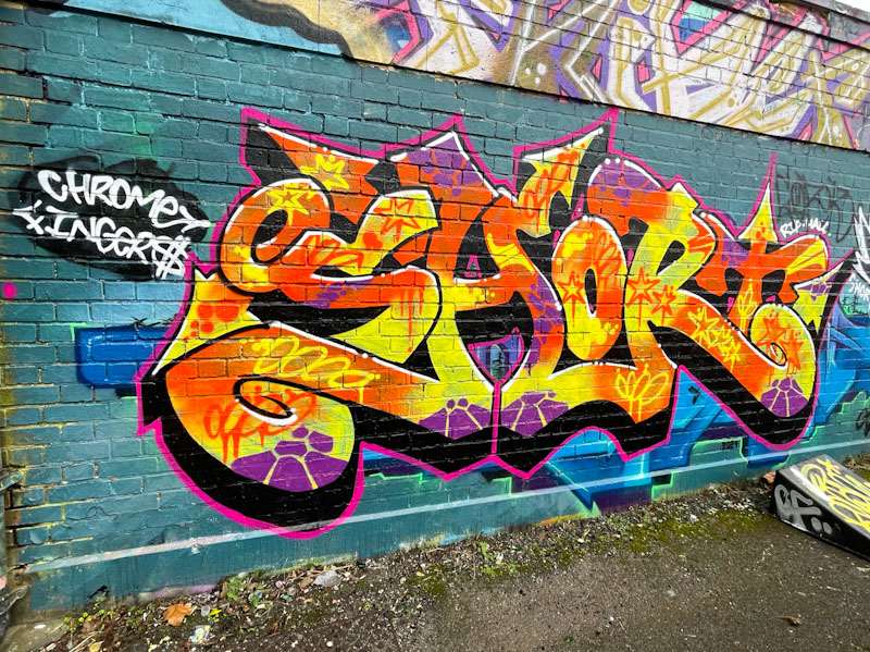
The fat script-style letters, with a nice deep drop shadow are beautifully filled with a burst of yellow and orange colour and some purple decorative touches, are nicely arranged and presented. The piece is painted over a Hire piece which acts as a contrasting background – no buffing here for Short. Watch out for more.
