
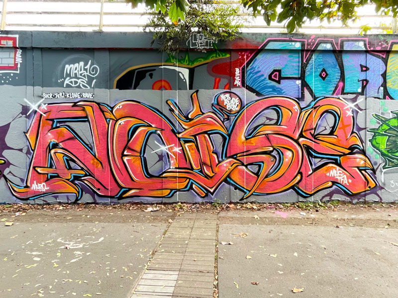
Although the letters in this piece are a little skinnier than one might expect from Noise, they are nonetheless unmistakably his. Of course, the fact that the letters spell NOISE removes any doubt whatsoever about the artist.
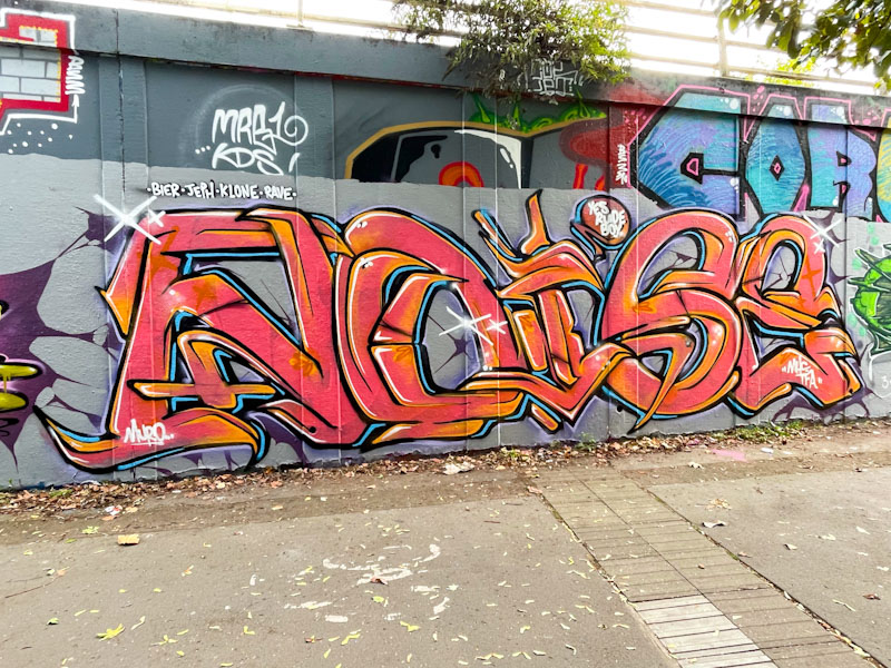
I would say that this is, in my view, one of Noise’s best pieces yet. By thinning his letters, he has created more scope for borders and intricate design, that perhaps his fatter letters restrict a little. The two tones of red and orange throughout are beautifully blended, and perfectly offset by the light blue border highlight. Even the grey buffed wall has been disrupted and made more interesting with some cracks. A really nice piece.
