
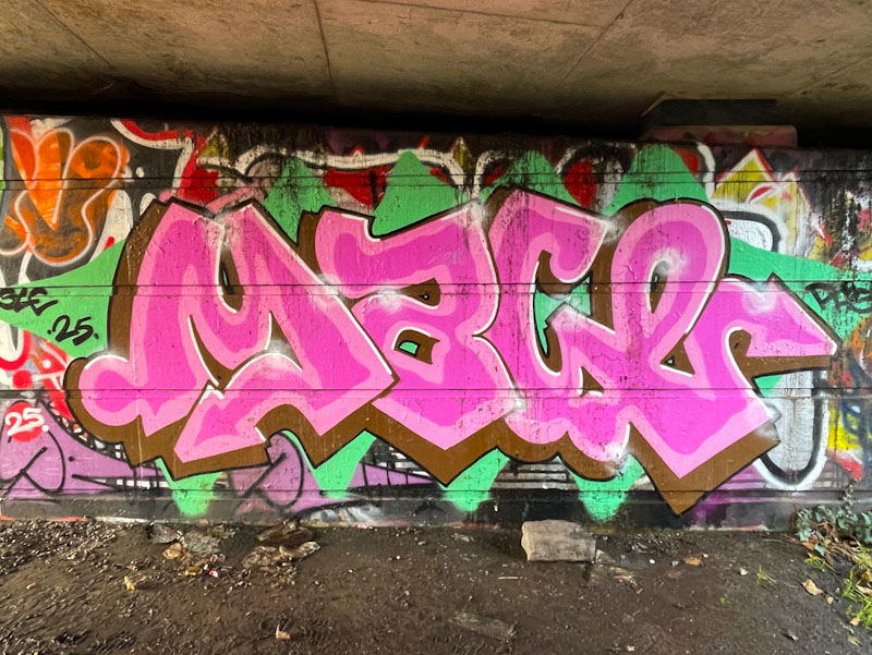
More from Mage, this time his writing has a slightly softer feel to it. I have said before that the letters MAGE, in my view are a little unforgiving, although lots of straight lines and sharp edges. By incorporating a lower case ‘a’ and ‘e’ Mage has managed to smooth out some of the lines.
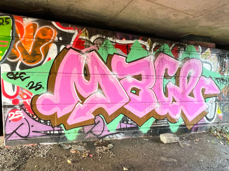
The two tone pink letters are bordered with a brown drop shadow, and you will know my feelings about brown by now, so possibly another colour would have been my preference. Mage has been a busy boy this autumn.
