
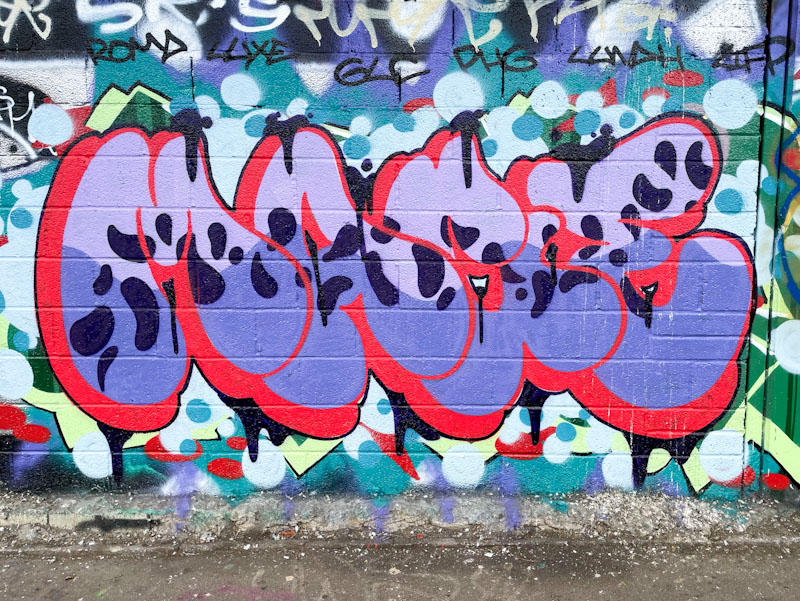
I am really pleased to see this piece from Mage, because it is almost as if he has read some of my posts where I have repeatedly said that his letter choice lends itself to sharp-edged and quite clunky writing. Here he proves me wrong with the same letters written in a softer, almost bubble-like font.
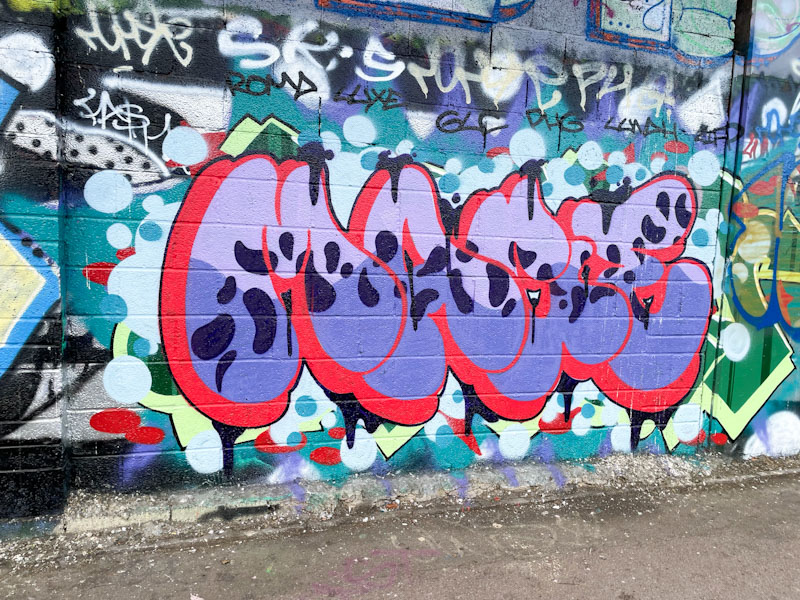
All the components are there, good letter design, a thought out fill pattern, great red drop shadow, and a little bit of decoration to distinguish the piece from the underlying graffiti. All in all a very nice piece of graffiti writing from Mage, who has surpassed the challenge of his letter choice.
