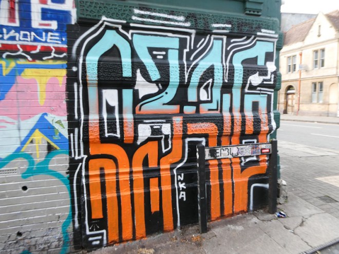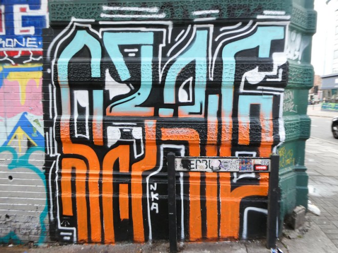
One of the most enjoyable things about Kid Krishna’s work is that he has breathed a little bit of life back into Stokes Croft. Over the years, gentrification of the area has led to a decline in available graffiti walls and a commensurate dwindling interest in spray-painting in the area. Not Kid Krishna though, he seems to favour Stokes Croft, and that is a good thing.

This piece perfectly illustrates Kid Krishna’s style of long straight letters on a single colour background. I still find his cryptic writing very difficult to read, but I am sure the penny will drop one day. I am guessing that this says KRISHNA, and I can see elements of those letters, but who knows? More to come from this relatively new-to-Bristol artist.


