7827. M32 roundabout J3 (784)

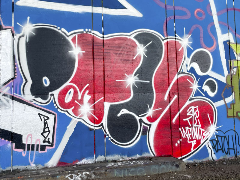
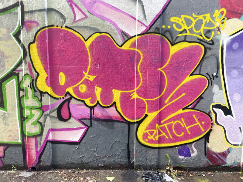
Patch, M32 roundabout, Bristol, June 2026

I really enjoy it when ‘new’ artists come on to the scene, and this is the third piece that I have found this summer by Patch. There is something about the simplicity and form of Patch’s pieces that I really like, and they remind me a little of TES’ letters that have remained reasonably consistent over many years (although he has been much more experimental lately).
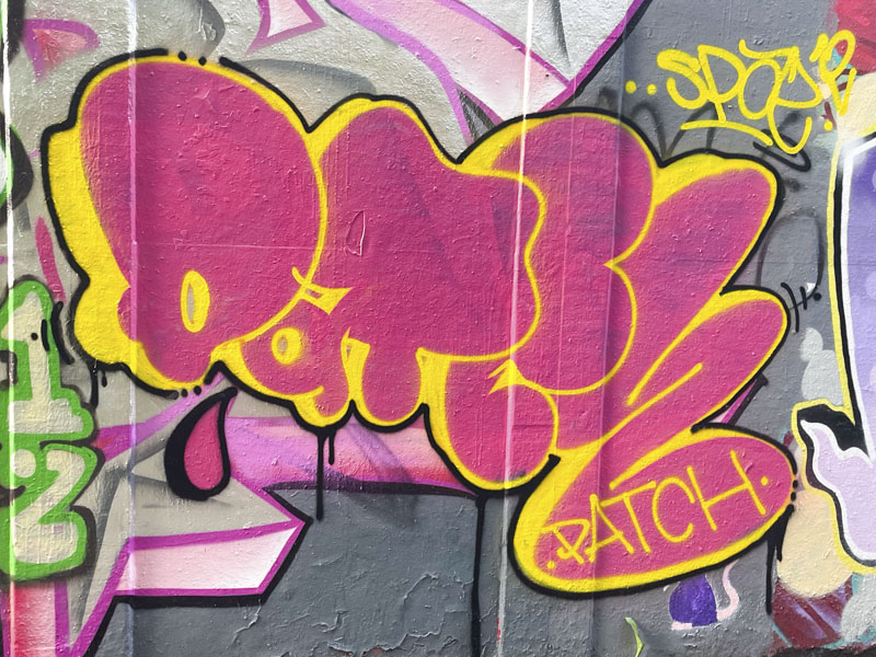
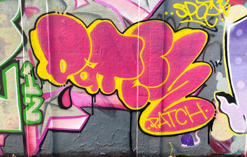
Patch, M32 roundabout, Bristol, June 2026

This straightforward piece with solid fills uses cartoon letters of varying sizes to create the word Patch. Just in case, the artist signs the piece as well for good measure. I look forward to seeing more of these mega-tag stamp pieces popping up around the city.



7816. Frome Side (69)

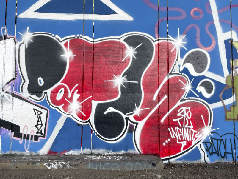
Patch, Frome Side, Bristol, July 2026

I only have time for a couple of really quick posts this morning as Mrs Scooj, the dog and I are shortly going to be driving back to Bristol from a short break in Cornwall. We’ll be dropping in on my sister on the way.

Patch, Frome Side, Bristol, July 2026

This is a nicely presented simple piece of graffiti writing from Patch, whose work has recently been appearing in Bristol. I like both the style and simplicity. Patch has added a little bit of additional interest with alternation the black and red colours through the piece. I’m looking out for more from Patch who is making an impression in the City.

7763. St Werburghs tunnel (587)

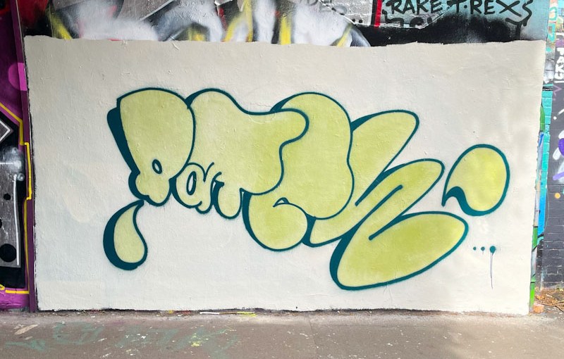
Patch, St Werburghs, Bristol, June 2026

I love it when new artists come on stream, and I have found a couple of pieces by Patch recently, and I am hoping for more. The obvious first impression from this piece is that it is clean, crisp, unfussy and what you see is what you get.

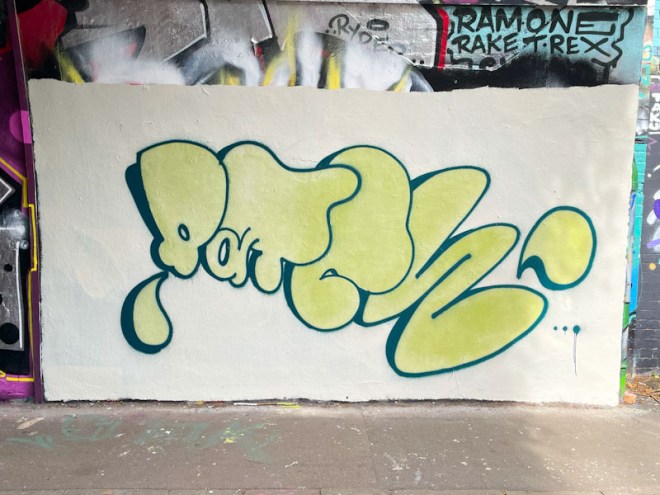
Patch, St Werburghs, Bristol, June 2026

Sometimes less is more, and that is the case here. The big clean background and cartoony fat script letters is all you are getting here. No fancy fills or frills, and I have to say I quite like it. The challenge for Patch will be how to switch it up a little without compromising the basic premise and identity created.