4584. Cumberland Basin

This piece by Serm, tells a story not only about his work, but also about the street art scene in Bristol, or any other place with a graffiti culture. As a photographer and chronicler of street art and graffiti in our city, I and others like me, have a pretty good grasp of what is going on, of who painted what and when. It is an earned privilege to have this overview, but it is also a rare one. Most artists, quite rightly, are interested in finding a spot where they can paint their new idea, without much consideration for what was there before.

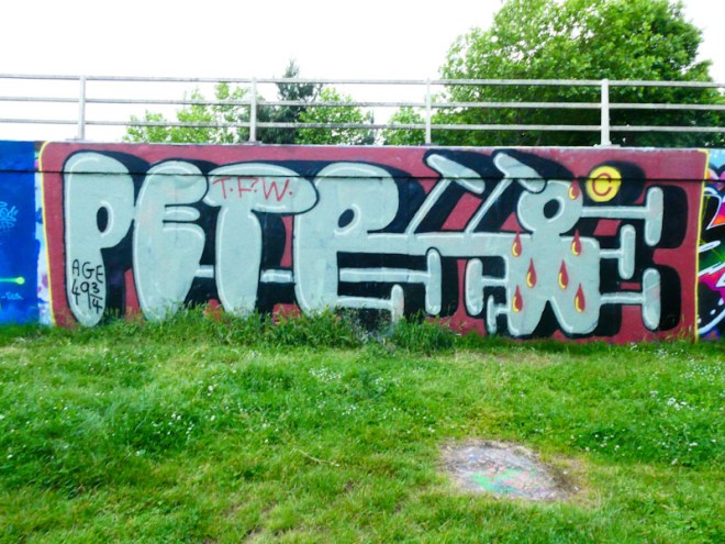
I came to photograph a new piece by Petro, but instead found this lovely piece by Serm. It is obvious that Serm didn’t know that the Petro piece was so new, otherwise he would have perhaps found another space. Serm has, however, broken a convention by painting over half a piece, which is considered to be a bit rude. A collaboration might have been a better option to paint over Petro’s piece. Enough background.

Serm, Cumberland Basin, Bristol, July 2022

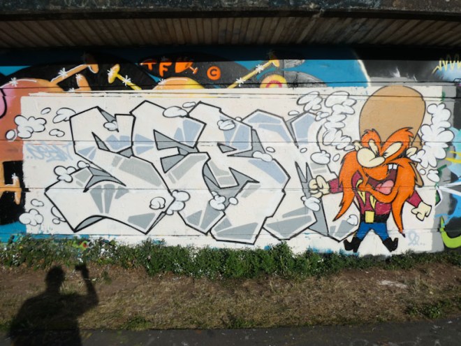
I have only seen a handful of Serm pieces and none of them with a character, so this was rather special. The writing is skilfully done in white with some shades of grey fills, but overall rather minimalist. The colour comes in the shape of the Yosemite Sam character on the right-hand side.

Serm, Cumberland Basin, Bristol, July 2022

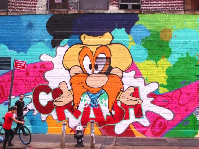
I am minded to do a gallery of cartoon characters, just for fun, because there have been so many painted by artists over the years, and all of them worth celebrating (of course time will be the limiting factor). The last time I saw a Yosemite Sam was in New York in October 2017, by Crash. This one by Serm compares very well to that one.

John Matos, Bower Street, New York, October 2017

4485.M32 roundabout J3 (411)

This is the first Petro piece I have seen for a little while, but like all his pieces it is most welcome. Spelling out the word PETRO, the letters have a rather organic feel to them not really conforming to any specific convention, but immediately identifiable as a Petro piece. I love the “age 49 3/4” which made me laugh. A fine piece.

Petro, M32 roundabout, Bristol, May 2022

Having returned from Porto in the small hours of this morning, I have had time to reflect on the comparative street art scenes in Porto and in Bristol. My conclusion is that the two cities have very different styles, Porto’s seemingly in its infancy and Bristol’s, a mature and extraordinarily diverse and accomplished scene. Both are exciting and vibrant but in different ways.

3744. M32 roundabout J3 (327)

This is just wonderful, a large organic piece from Petro and the second to appear on Natural Adventures. Petro is an artist that I have taken an instant liking to. His unusual, subdued colour selections and desire to fill as much space as possible with his writing really appeals to me.

Petro, M32 roundabout, Bristol, June 2021

In this piece, it is the 3D purple shading that catches the eye as it sucks everything from the right to the left. As well as spelling out PETRO, he also includes the letters TFWH, although I don’t know what these relate to – a crew possibly. Big, bold, psychedelic and modestly outrageous – I love it.

3728. Brunel Way (107)

Another new artist, who is without doubt causing a stir at the moment in Bristol, is Petro, whose Instagram handle is delightfully @intheallotment. I’m not sure where Petro has come from, but there is a lot of experience in this work, and while new to Bristol, Petro is no stranger to throwing paint at walls.

Petro, Brunel Way, Bristol, May 2021

Petro likes to go big and all the work I have seen so far is large. Big letters and earthy colours characterise Petro’s work. There is also something about the unruly nature of the letters that reminds me a little of Taboo, Alos and Whos, all of whom seem to break conventional rules of letter shapes and designs. This is a lovely organic piece, and I have several more beauties to share with you.