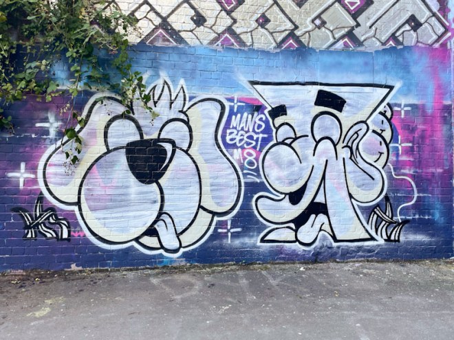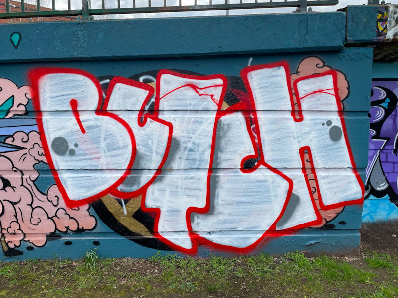
I have to confess that I have a real soft spot for Butch’s graffiti writing. I like the name, I think it lends itself well to the art form, I like his letter shapes and I like his understated presence.
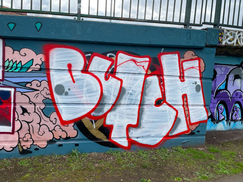
Butch has a fairly standard approach to arranging his letters where, going from left to right, each letter overlaps its successor. With the addition of some shadows, this method provides some depth to the piece. This looks like a bit of a quick one, with a white fill that barely does the job of filling. A couple of nice spots round the piece off nicely. More on the way from Butch.