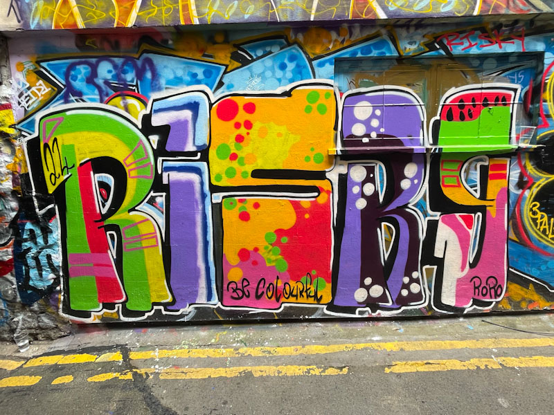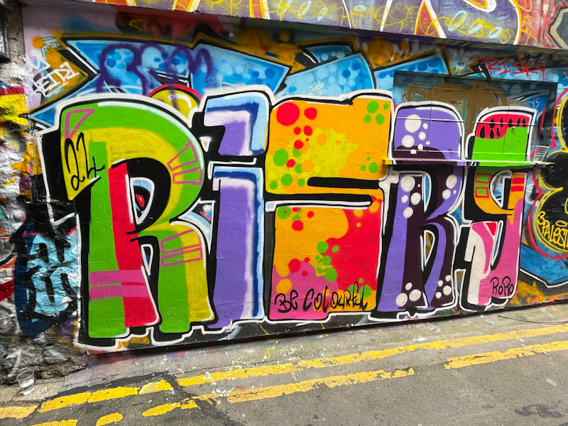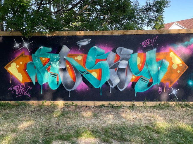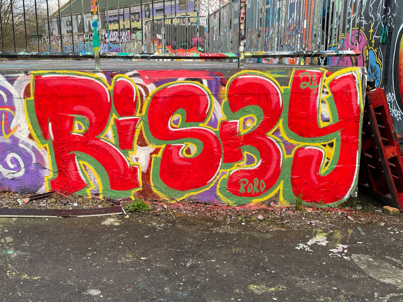
It feels funny posting this piece by Risky, because it is only the third to have made it onto the pages of Natural Adventures, but I have been photographing his work for at least two years, so I am surprised I haven’t published more. I know little about the artist, and can’t find any socials at all, so until I catch Risky in the act I’ll have to remain ignorant – having said this, I have a nagging feeling that I may have met him a while back, painting under Brunel Way… the old grey matter isn’t what it used to be.
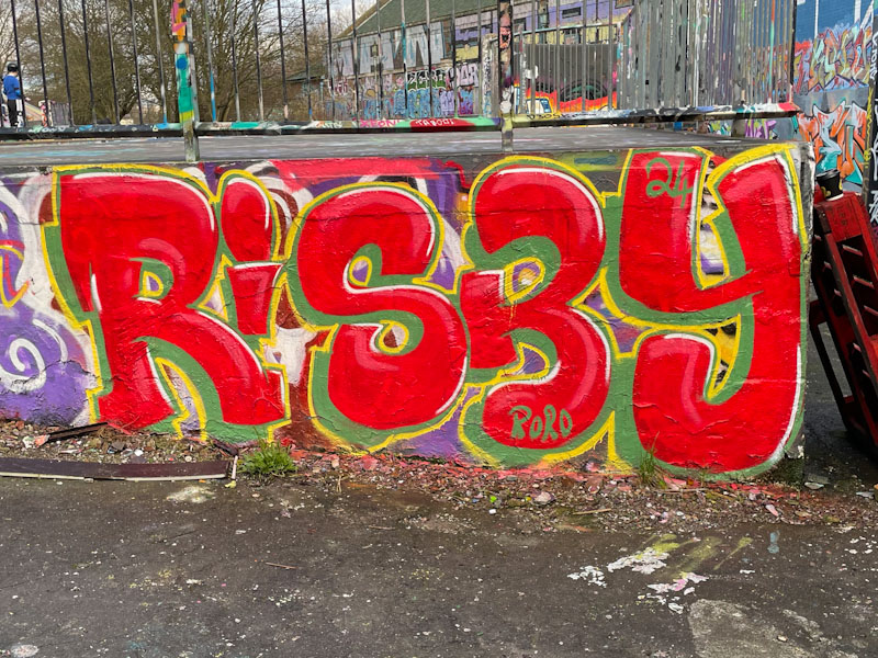
I love it that Risky, like so many other occasional writers in Bristol, turns up from time to time with a vibrant and colourful piece like this one, that really catch the eye. While this isn’t technically high-end, it has loads of things that I like; some great letter shapes and that strong red colour works really hard; some interesting white highlights that help the letters to pop, and some more subtle red highlights, adding a bit of depth to the letters; finally, a green drop shadow and yellow border. Although not the tidiest piece I have seen, I really like it.