
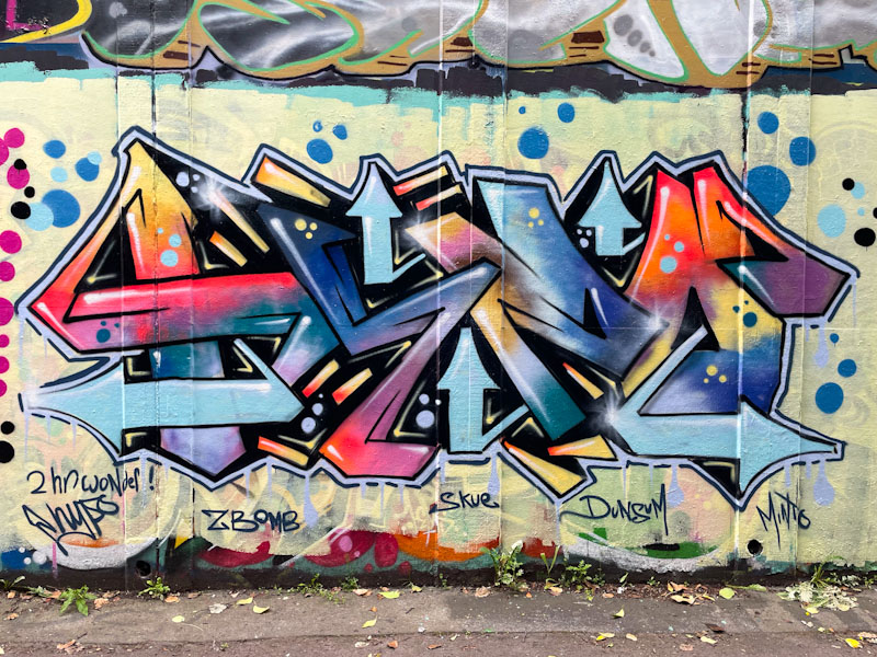
For the last year or two, Hypo has been turning out terrific pieces of a consistent high quality and on a pretty regular basis. His letters HYPO lending themselves to a certain degree of symmetry, which often comes across, which is well demonstrated here and can be spotted if you focus on the positions of the five light blue arrows.

The colours are nicely presented and transition well in the fills. There is also a lot of depth to the letters created with mid-lines, shading and accents. Hypo is a specialist at creating this kind of energy and effervescence in his writing, perhaps learned from and shared with his friend Hemper, who is a master of this kind of wildstyle graffiti writing.
