
A gallery of outstanding graffiti writing from Bristol’s Dott Rotten (Spoilt)
Instagram: @dottrotten
All photographs by Scooj


A gallery of outstanding graffiti writing from Bristol’s Dott Rotten (Spoilt)
Instagram: @dottrotten
All photographs by Scooj

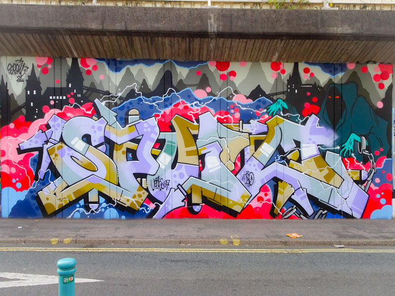
Dott Rotten is without doubt one of the best writers in Bristol, although he is just one artist in a very strong field. This beautiful ‘spoilt’ piece is filled with fruit salad colours, transitioning sweetly between the letters, with characteristic detailing and supreme finishing with clean lines and edges.
The whole piece contrasts perfectly with the blue background of clouds and bubbles. To the right hand edge is the word Jelly, although I have no idea what this refers to. As with so many of Dott Rotten’s pieces, it is extra large, and took up the space of at least two typical pieces you might find in the tunnel. More magnificent work from the maestro.

Dott Rotten has been mighty busy in the last month or so, treating us to some really impressive large pieces, of which this is the most recent (I think). His writing is different from other writers in that his letters have a kind of flat surface, rather than a 3D effect with feature lines and shading.

The letters spell SPOILT, and the other word is ‘devine’, although I’m not sure what the reference is. The whole piece is beautifully presented on a black buffed wall with a red and pink bubble background. What you can’t really get from these photographs is the scale of the piece. Dott Rotten certainly isn’t afraid of ‘going large’.
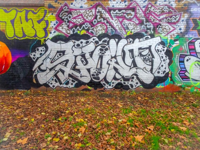
Every once in a while, I take a quick canter through my archives, just to see if there is something significant that got left behind. This is most definitely a piece that I should have posted back in September 2017, but like so many pieces before it, missed out. I am sharing it now.
The writing is by Dott Rotten and spells out SPOILT, which he most commonly writes. What is interesting about this piece is that it is quite unlike much of his other work, and could easily be by half a dozen other artists about the place. Everything about the piece is good, the background and the design of the letters and fills. It is the execution though that stands out; this is a perfectly finished piece, crisp and clean, from a master.
Dott Rotten strikes again with this magnificent art rather large Spoilt piece on the M32 roundabout. He has been enjoying these rather large-scale pieces recently and definitely makes the most of the available wall space.
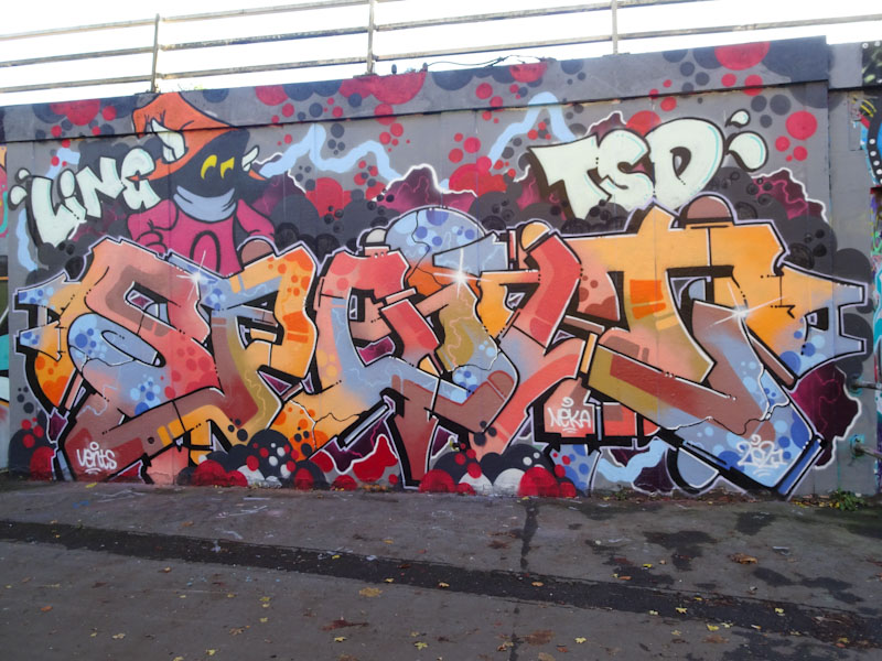
There is an autumnal/winter feel to this piece, with muted colours, and the overall superb skill in bringing all the elements together is masterful. The fills, the lines and the design are all really tight. This is a very accomplished piece and to top it all off Dott Rotten has added an Orko character from 1980s cartoon series He Man.
This is a very special piece.
It takes a rather silly person or one who holds respect to paint over a 3Dom piece, and fortunately, Dott Rotten falls into the latter category. This is a magnificent and quite large ‘Spoilt’ piece at the top end of Stapleton Road by the M32 Spot.
The quality of the piece is right out of the top drawer and in addition to the superb writing Dott Rotten has treated us to the addition of some ghoulish scenery and a ghostly character. There is so much going on throughout the complex piece in three spaces – in the foreground is the writing sitting on a cloudy red and blue layer, and in the distance is the scene described earlier. A truly great piece.
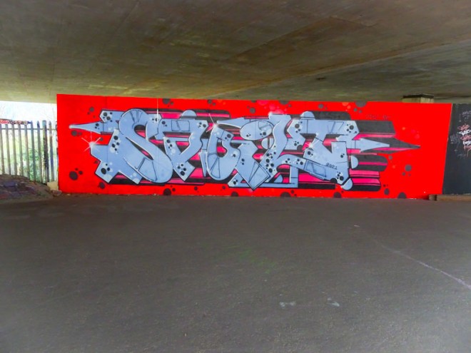
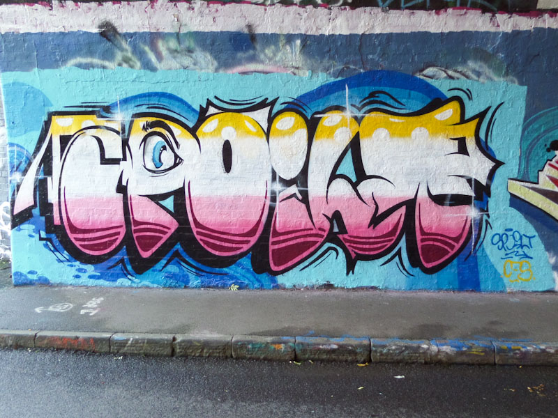
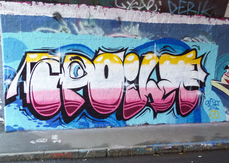
It took me several goes to get a half-decent photograph of this rather nice piece from Dott Rotten. The first set of pictures were very dark for some reason and the second set had the palette board completely in the way. It kind of came together on the third attempt.
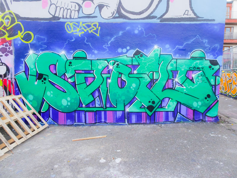
I learned a lot about Dott Rotten when I met him recently at the other end of town and told him that I was very much enjoying his current productive spell on the street, which he seemed to be enjoying too. This ska nice SPOILT piece with the 3D shadow dropping down vertically in blues and purples. One of a very fine series of pieces.
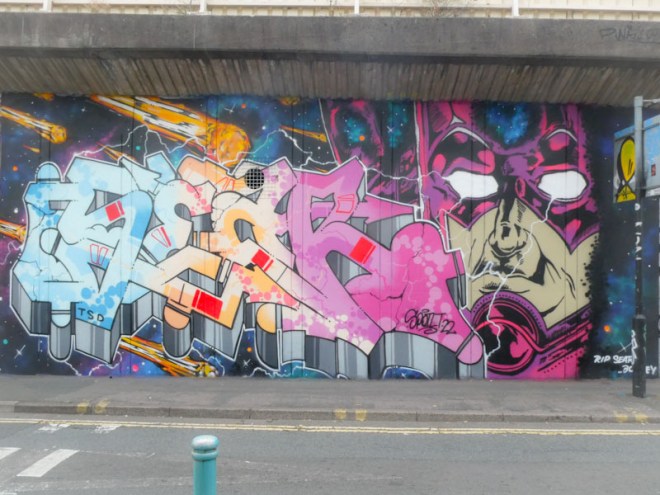
Simply stunning! This is a magnificent piece of graffiti writing from Dott Rotten, notable as much for its fabulous and striking colours as it is for the fabulous design and technical excellence.
I had a great chat with Dott Rotten last week, not far from here, and he told me that it hasn’t always been easy and that at one point he had considered giving up on graffiti writing altogether. Thank goodness he thought better of it as he is turning out some of the best work in Bristol at the moment. This is an instant classic in my eyes and yet another fine piece of work on this subterranean wall.
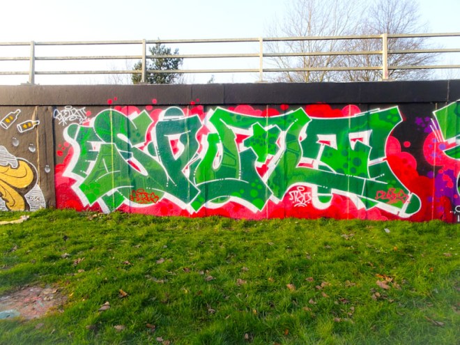
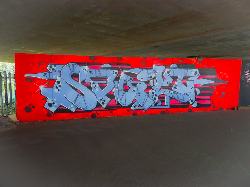
Dott Rotten has been spoiling us with his SPOILT pieces of late, and this red and green beauty on the M32 roundabout is an absolute classic. Dott Rotten’s writing style is fairly recognisable, although when he writes other letters it can take me a while to pin him down. However, it is not so much the style that gives him away as the quality of his finishing.
In that respect, there are some similarities with Rusk’s work which is always so neat and tidy. These joined up letters are brought to life with a light and dark shade of fill with some repeating patterns of dots and boxy segments. What makes it jump out though is the wonderful contrast with the vibrant red backdrop. A lovely piece.
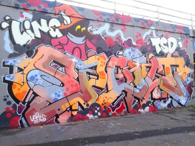
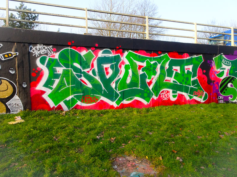
Another artist having a bit of a spree at the moment is Dott Rotten, whose work is in the top division. Take a look at this piece of graffiti writing from a week or two back and tell me that it isn’t out of the top drawer. This is an artist who is at the top of his game and seems to be enjoying it.

The writing with his familiar SPOILT letters is nicely worked with two shades of blue, perfect orange outlines and some superb trademark bubbles. The whole piece is lifted up with a deep red 3D shading. This is great graffiti writing.


