
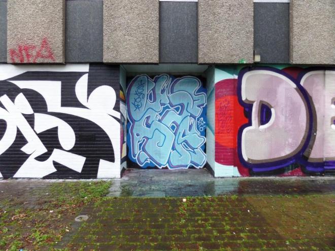
This is a quick one from Whysayit in Upper York Street, replacing one he had there before. It is also a quick one from me. I like Whysayit’s work, and the way that he fist his moniker into the space available, always retaining his characteristic ‘font’. While not his best or most colourful piece, it is still skilfully worked.

The colors are not working for me. But interesting lettering.
LikeLiked by 1 person
I think it is a bit of a lazy throw up, but I like to post the spectrum of work from these artists, to demonstrate their range.
LikeLiked by 1 person