
There is an interesting crossover with this piece from Soker in so much as it is an Upfest 75×75 piece from a Bristol graffiti writer who produces this kind of thing regularly all around the city to this high standard, without being ‘special’ event pieces. I’m not sure if I articulated that very well, but perhaps what I mean is that we are spoilt in Bristol with having so many outstanding writers like Soker.
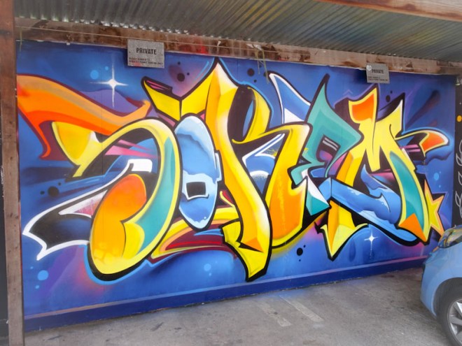
This is a lovely clean and colourful design from Soker, spelling SOKEM. There are two or three colour/fill themes going on through the letters and a central vanishing point for the 3D shading. This is what great graffiti writing looks like.

Yeah he smashed it as always and it was great to see some graff being painted as part of Upfest . . .
I would have loved to see more top quality graff being done for Upfest especially perhaps a mix of art and calligraffiti in the same piece . . .
Perhaps next year . . .
LikeLiked by 1 person
It would be nice to shift the bias a little.
LikeLiked by 1 person
I reckon so . . .
LikeLiked by 1 person