
Mest is an artist whose writing is improving all the time, not only in quality but also in creativity. Sticking to his standard letter shapes, he gets his variety through his fill designs and colours. I have so many more of his pieces that are not yet published, but posting pieces on Natural Adventures is a very competitive marketplace at the moment. I will get round to publishing more in due course.
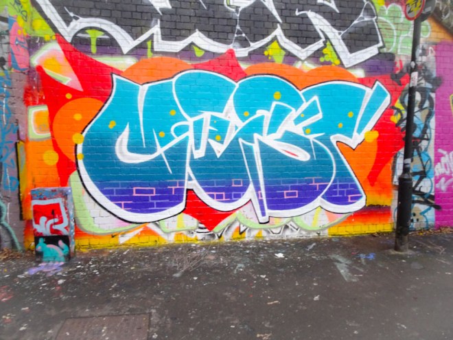
The colour contrasts between the orange background and cool blue letter fills works wonderfully, a real hot and cold battle going on in front of our eyes. Mest has also been playing a little by picking out some of the brick work with pink lines. A sprinkling of little yellow dots rounds the piece off nicely. A fine piece from Mest which gets me ever closer to publishing a gallery of his work… watch this space over the next month or two.

Definitely a bold piece and I like how his letters have recently undergone a little transformation which has made then easier on the eye . . .
LikeLiked by 1 person