
One of the most recognisable styles in Bristol is from Taboo, and the interesting thing about that is that although he usually writes ‘Taboo’, no two pieces look the same, unlike some writers who like to recreate their letters in a similar format from piece to piece.
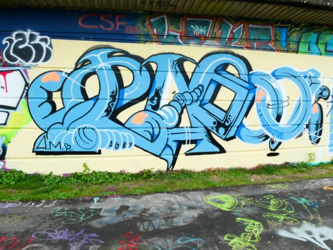
In this one, Taboo’s unruly letters, once again seem to defy convention, for example, he uses two different border colours halfway through the word. The letters are imaginative and creative, and don’t really follow a font style, although one can tell that they are all by the same artist. No character in this piece, which is a bit of a pity, because they add a further dimension to the overall work. This is yet another wonderful piece of writing from an artist who likes to plough his own furrow.
