
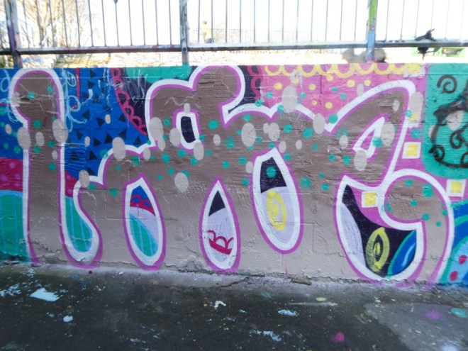
I’m not quite sure how it happened, but this piece and another one somehow got stuck in my publishing conveyor belt. Human error, of course, but I have managed to recover the mistake and bring you something a little different from Logoe, painted back in January.

Logoe’s letters are usually in a rather scratchy script form, but for a change he has presented us with fat, nicely rounded letters. Perhaps he was having a Rubensesque moment. The signature feature of a scattering of colourful oval dots in a horizontal row identifies the piece as one of Logoes (which of course the writing does too). Very nice to see something a bit different.
