

I love it when a new artist appears on my radar and I start to see their work all over the place. I think that Raid is a relative newcomer to Bristol, but he is already making an impact with his distinct and attractive writing.
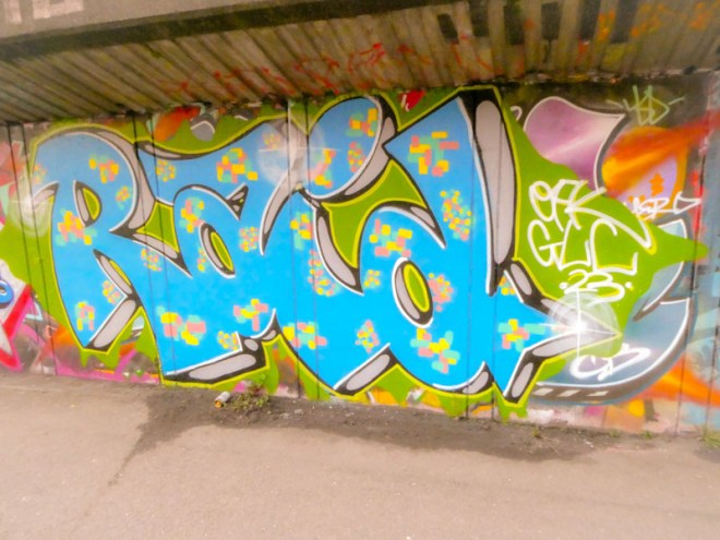
The letters spell RAID, with the ‘A’ being rather distinct. The letter shapes seem to be retained from piece to piece, so it is the drop shadow and fills that change, and he has done a superb job with this one. The drop shadow is cleverly done with a black surround and grey middle, adding character and interest. The solid blue fill is decorated with colourful pixel patterns, creating a rather joyful overall feel. More to come from Raid soon.
