
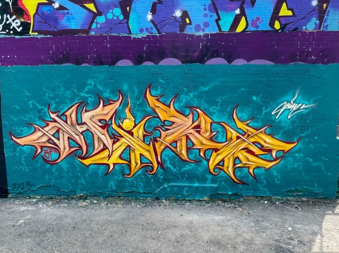
It might be the colour palette, I don’t know, but there is something about this piece that instantly grabs you and says ‘hey, I’m special’. Hire’s work will be a familiar to regular readers of Natural Adventures, and he is one of my favourite graffiti artists in Bristol, and I think that what he has done here is exceptional.

Three things stand out for me in this piece. The first is the colour selections for the letters and the background and the way they complement each other so well – very pleasing to the eye. The second is the almost imperceptible difference in colour shade used for the H and R, compared with the I and E of his name, so subtle and so clever. Finally, I think that the little squiggles surrounding the letters are brilliant and remind me of a visualisation of Brownian motion. Each of these elements lift the piece from being great to exceptional.

I agree
LikeLiked by 1 person
Indeed an absolute cracker . . .
I bumped into him yesterday doing something rather different which was of course great . . .
LikeLiked by 1 person
Lots going on this weekend!
LikeLiked by 1 person
As always . . . 😉
LikeLiked by 1 person