
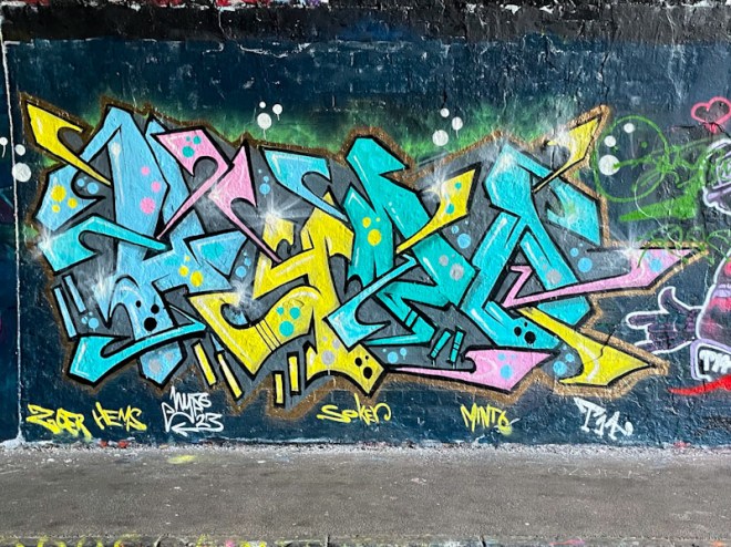
One of the artists I have most enjoyed over the past 12 months or so has been Hypo, who has been out and about a lot during that period (in part due to poor health and recovery). I think that part of the secret to his success is his choice of letters, which are really playful, and allow a lot of flexibility. Some letters and combinations of letters simply don’t work as well as others.

I sense a little bit of a Hemper influence in this piece, which is quite elaborate and intricate. Hypo has selected some cheerful light colours that interlock, creating an integrated whole that is nice to look at. I’m not too sure that the copper outline quite works, but on the whole this is a fine piece of writing.
