

What a nice surprise it was to find this collaboration from Werm and 3F Fino, who I thought may have left Bristol (which he might have done), given the almost total drop-off in his work in the city. It felt coincidental, too, that I found this piece only a day or two after publishing a gallery of 3F Fino’s work.

To the left, Werm has worked a wonderful piece of writing painted using a fabulous colour palette of purple shades and gold. This sumptuous colour scheme creates an interesting effect, where the letters, counterintuitively, are a little more disguised than you might expect. The gold colour, although contrasting with the purple colours, doesn’t ‘pop’ the piece as much as you might expect, instead it has a rather more subtle impact.
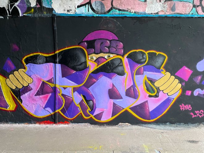
To the right, a character that 3F Fino has painted many times, is holding up letters that are painted in the same colour scheme used by his neighbour. The letter fills are very nicely painted and go a long way to obscuring the letters themselves. I would like to think the letters spell FINO, but can’t be certain, and have a feeling that the fills might also spell something out. Altogether, this is a very nice collaboration from the LRS pair.
