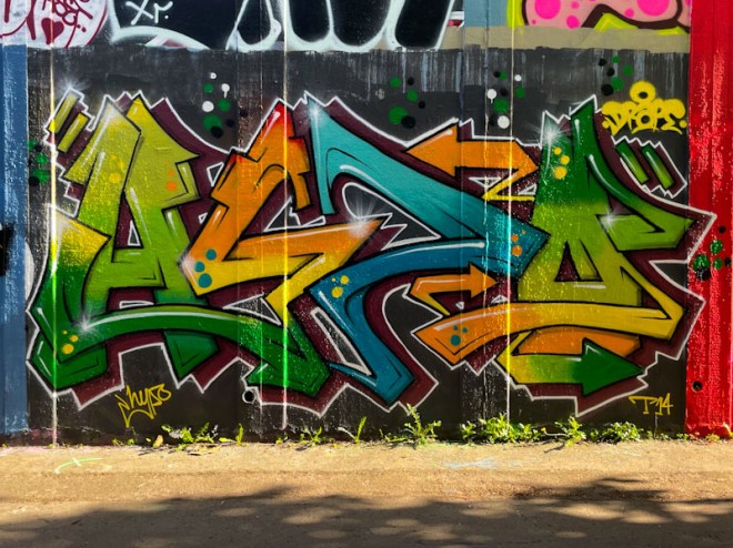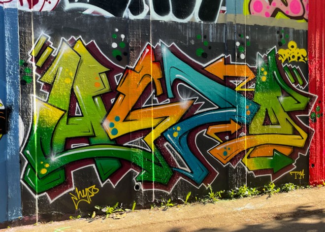
I have enjoyed immensely the vigour with which Hypo has upped his game over the last year or two, both in terms of the quality and quantity of his painting. Sticking with his HYPO letters, he has come up with a sequence of colourful and strong designs of which this is one of his more recent.

Unfortunately I captured this piece on a late sunny afternoon, and there is a bit of glare, but it doesn’t hide the excellence of the artwork. The colour palette is really good and the transitions through greens to yellows and oranges and blue are really well done. some spots are added for decoration, but it is the overall design of the letters and the clean finishing that I am particularly attracted to in this piece. Great work from Hypo.

Indeed one of my favourite pieces by him so far . . .
LikeLiked by 1 person