
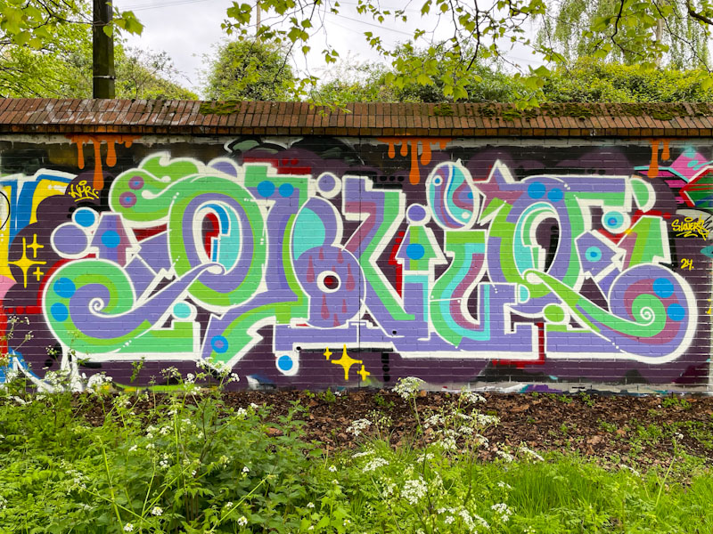
What stands out for me in this lovely piece of graffiti writing by Claro_que_sssnoh is the subtle colour selection and slight softening of his letter style. The writing runs smoothly, where often his letters can have a slightly staccato feel running through curvy to straight lines in abrupt fashion.

I am not entirely clear what the writing spells as I would usually expect to see HONS. Claro_que_sssnoh has managed to do just enough of a background and ‘sparkles’ to differentiate his piece from the pre-existing pieces on the wall, and drips ad further interest. For me though, it is the colours that shine. Nice work.

Different letters but the same style
This time he wrote ‘OBVIO’ . . .
LikeLiked by 1 person
Now you tell me it looks absolutely obvio(us)
LikeLiked by 1 person
. . . 😂😂😂
LikeLiked by 1 person