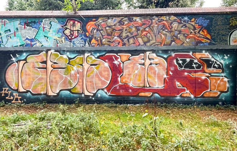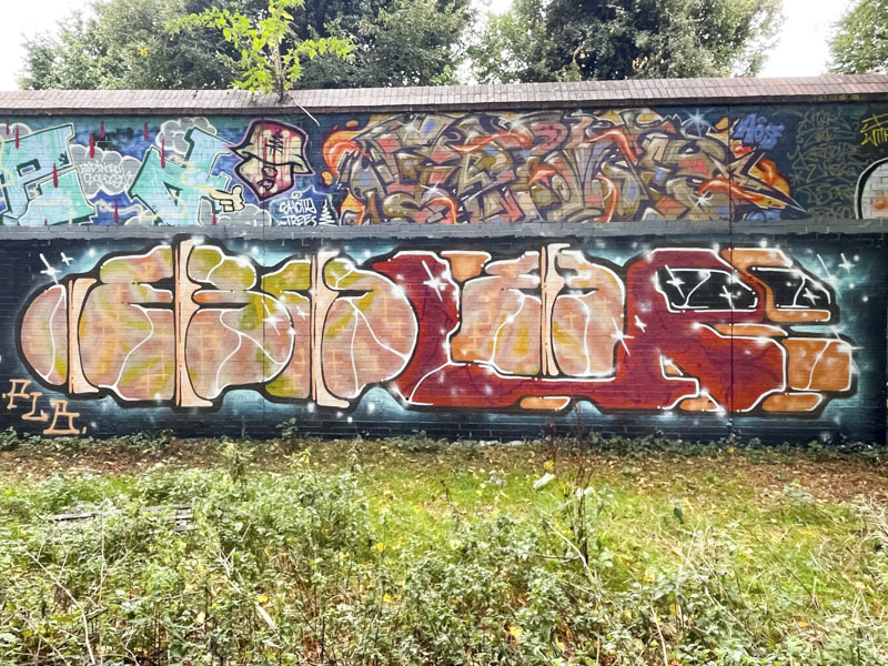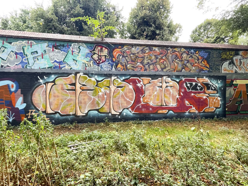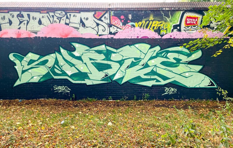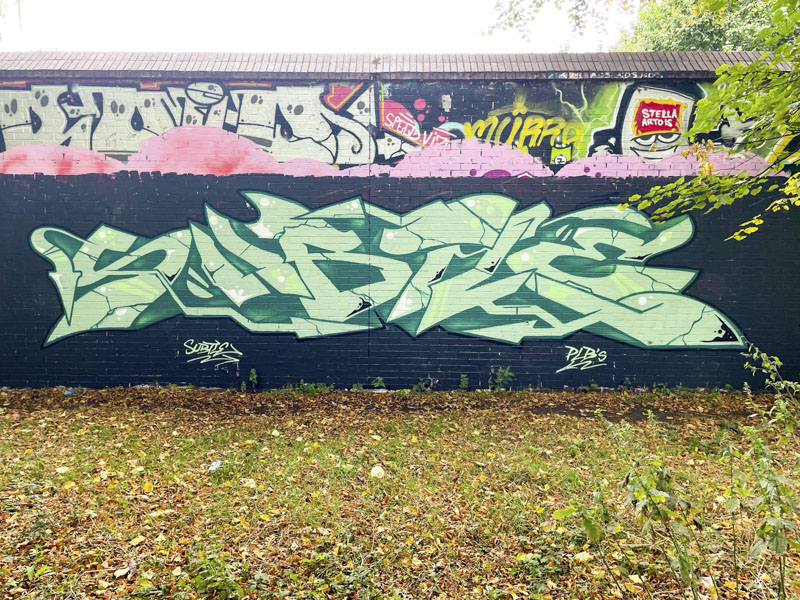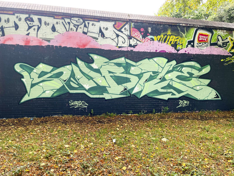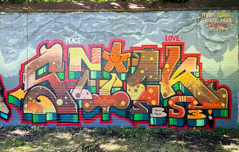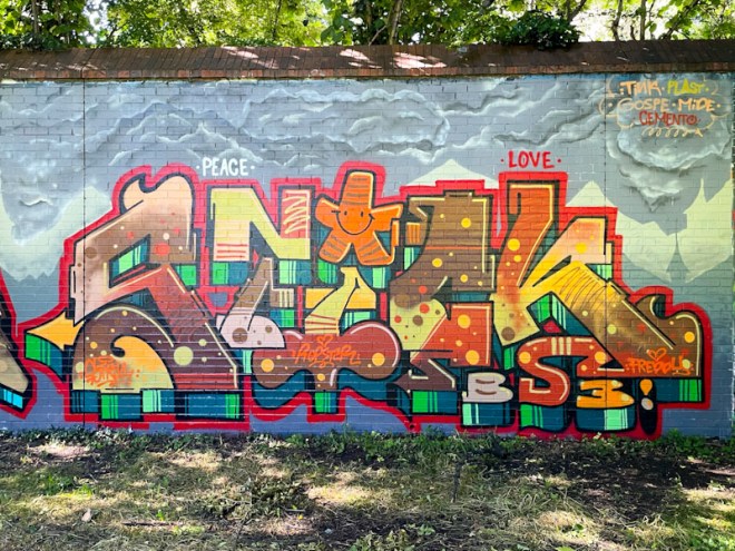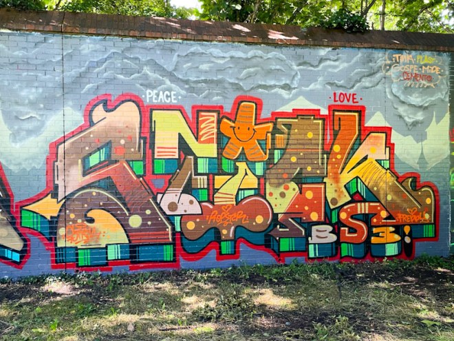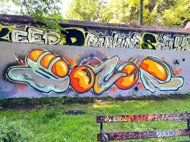
The style, which is instantly recognisable, and the letters ARSA combine to tell us who this attractive piece is by. There is a lot of precision in the piece, aided by the mortar lines on the surface of the brick wall.
Arsa, Sparke Evans Park, Bristol, April 2026
The letters are filled with a camouflage colour palette and patterned in an unblended fashion. There is a nice drop shadow and red border, but the signature element in Arsa’s work is the symmetrical presentation, which works really well. Distinctive and pretty cool.
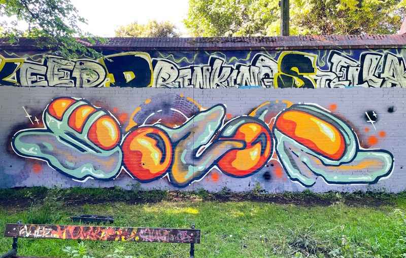
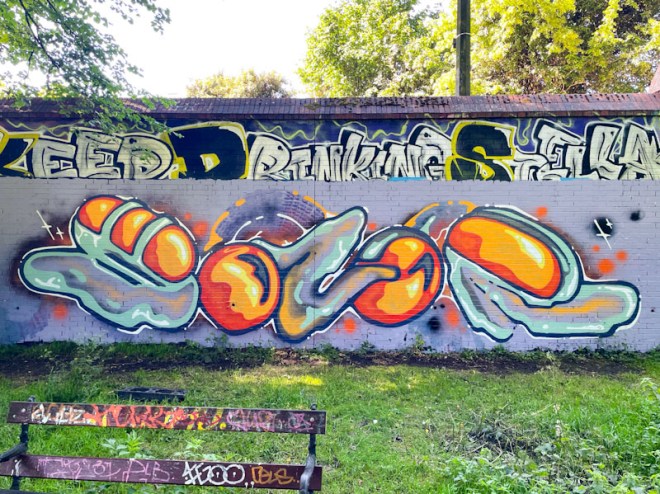
Two significant things are happening today. Most importantly, Arsenal will be getting their hands on the Premier League trophy at Crystal Palace’s Selhurst Park this afternoon, and fans can properly celebrate. Also important is that this weekend is the second of three in the Upfest Street Art Festival in Bristol, which I will be popping down to later on this morning. In the meantime, here is a beautiful piece of graffiti writing from Mesk, AKA Lazureness.
Mesk, Sparke Evans Park, Bristol, April 2026
This is a wonderfully fresh piece, set on a white buffed wall, with a lovely clean look to it. The green fills, transitioning through the MESK letters, work incredibly well together, and along with the black drop shadow and small yellow strip detailing, leave us with a near perfect piece. So good to see.
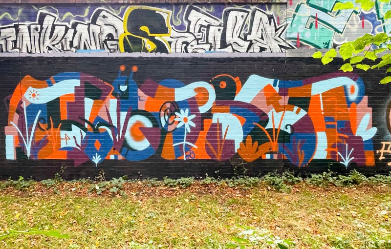
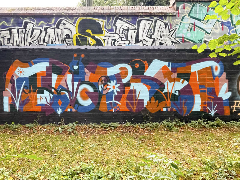
Minto has been out and about quite a lot this year, which is great to see, and recently he has turned out a couple of pieces on a black background, of which this is one, that introduce a whole new aspect to his work, bringing in all sorts of opportunities for contrasting colours.
Minto, Sparke Evans Park, Bristol, May 2026
The letters, heavily disguised, spell MINTO, and they are heavily augmented with colours, lines and shapes that almost give a ‘firework’ appearance to the piece. I can see at least two ephemeral characters in the piece, a bird’s head in the centre, and a head at the top right. There is so much to look at and discover i this fine piece of graffiti writing.
RBN One, Sparke Evans Park, Bristol, February 2026
The turnover at Sparke Evans Park had been quite slow over the winter months, as pretty much the whole wall had been adopted as a tribute wall for Paroe and to a lesser extent Dorns. Over time new pieces emerge, but mostly as single or doubles at most out of respect for the tributes.
RBN One, Sparke Evans Park, Bristol, February 2026
With the emergence of spring, and a limited number of walls available to paint, tribute walls are a luxury that have their time but yield eventually to new art. RBN One painted this awesome piece at the far right-hand end of the wall at Sparke Evans Park. His beautiful grey letters, lifted with a great 3D drop shadow, are filled with a red mid-line and grey and white reversed out spots. The dramatic yellow background with floating blocks is a perfect host for the piece. Lovely graffiti writing.
Nips continues to delight with her work and her pieces seem to be coming thick and fast at the moment. Although the last piece I featured here by Nips was a chrome delight, it is her fills that are the trademark of her work. The letters are separated from the background with a contrasting purple drop shadow, but it is the outstanding letter fills that are so captivating in this piece.
Nips, Sparke Evans Park, Bristol, February 2026
Nips’ letter shapes tend to remain fairly constant, so the interest is around what she does with colour and form in her fills and background. Here she has mastered both. Starting with the background, Nips has opted for a fairly minimal coverage but used it well with a blend of fiery oranges and yellows. A combination of greens and browns are washed together, creating something similar to a tie dye effect. This is brilliant and presented by an artist who shows confidence with her colour selections. Excellent.
Dog Bless the Band, Sparke Evans Park, Bristol, February 2026
I am taking a bit of a punt on this one, because it can be difficult to be sure who the artist is of an unsigned work… you have to go on style alone. I haven’t seen much lately that I could nail down as a dead cert Dog Bless the Band piece, although there have been a few candidates. He used to make it a bit easier by always writing MOTEL with a very distinctive ‘M’, but those are not necessarily the letters here. The selection of modest earthy colours is another indicator as well as the soft and blended fill style. Looking at his previous work, I think that I am reasonably confident it is the work of Dog Bless the Band.
Dog Bless the Band, Sparke Evans Park, Bristol, February 2026
I have to say that I am a big fan of this style of writing, there is something organic and ‘mother earthly’ about it. It is gentle and unthreatening, almost as if created by nature itself. I will be on the lookout for more from this artist, and may have to raid my archives to dig out some ‘probables’ that I can attribute to him. Very nice piece.
Nice One, Sparke Evans Park, Bristol, February 2026
I make no secret of my admiration for Nice One’s work, and with this outstanding seascape he has gifted me my favourite piece of the year so far. I have history with fishing boats, and the marine environment more generally, so the content of this piece chimes perfectly for me.
Nice One, Sparke Evans Park, Bristol, February 2026
It is more than possible that this is the best piece I have seen from Nice One to date. There is a tranquillity about the calm sea and the bubbling clouds, and the proportions and presentation of the boat are perfect. This is so very different in both style and content from pretty much anything else we see in Bristol, and we are all better off for it. Bravo!
I knew from my Instagram feed that Biers has changes his letters recently from WD40 to RABIES, and this is the first piece that I have seen in his new persona. I have to say that I really like his choice and the enthusiasm that has come with it. Furthermore, I think it gives him more scope than his former WD40 option.
Biers, Sparke Evans Park, Bristol, February 2026
The letters in this wonderful chrome piece are a little unruly, in a good way. I also note that the second half of his letters BIES, isn’t too far away from BIERS, which are the letters I first associate with him. The sparse decoration in the letters is just the right amount, and the contrast with the red background separated only by the thinnest of yellow lines. This might signal the start of a refreshed Biers – I hope so.
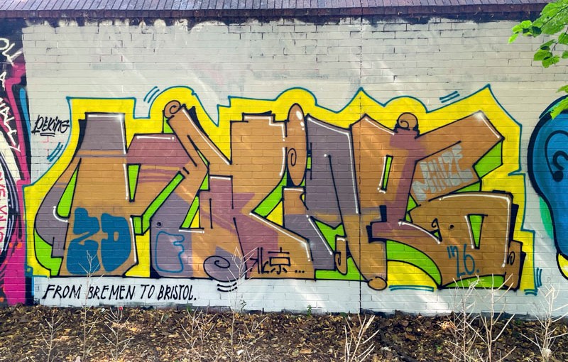
Since first creeping onto my radar, Solar has gone from strength to strength, and is now turning out some high quality pieces that are most attractive to the eye. In this instance I will forgive the overwhelming amount of brown and concentrate on the style of the piece.
Solar, Sparke Evans Park, Bristol, February 2026
The letters are isolated from oner another thanks to a yellow drop shadow, and their shapes are rather unruly, although adhering to his overall style. Each letter has the appearance of a boulder with cracks running through, a fairly common device used in graffiti writing. The whole piece is finished off with some contrasting starbursts and a not to PLB (Placebo) and tribute shout-out to Paroe.
Totosoapcity, Sparke Evans Park, Bristol, February 2026
Some beautiful and distinctive letters from Totosoapcity, who prefers to be referred to as ARSA. When I have time, I will change all the images I have of his work to ARSA, but this takes a lot longer than one might think. Rather like Werm’s pieces there is a lot of convergence on a bilateral symmetry in ARSA’s pieces, which is cleverly presented.
Totosoapcity, Sparke Evans Park, Bristol, February 2026
The grey and cream letters with a rather nice red drop shadow seem to ‘hover’ above a mustard yellow background. This is not an ordinary background, but one that has a kind of pixelated appearance, breaking up any monotony. A nice fresh and vibrant piece from ARSA.