

Recently I have managed to miss out on a couple of Hire pieces, because I have just been too slow, and for some reason, his work has been getting overpainted quite quickly lately. I think it is bad timing on his part more than anything more sinister than that. So I was particularly pleased to catch this one.
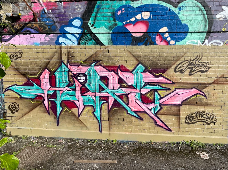
I have been an enormous fan of Hire’s since the first pieces I saw, many years ago. He consistently turns out brilliant graffiti writing and occasional rabbits to such a high level of precision. In this piece he has used the willing combination of pink and blue to create his HIRE lettering, but what I particularly like here is the interaction between the letters and the brown background, which is impacted by, and augments the letter shapes. Very nice work from Hire.
