

Note to self… take better photographs. This piece is something of an outlier. It is by an artist called Whos, who is known for his anti-style writing, so when I first saw this it didn’t register that it might be by him. It was only after talking to Conrico at the Cheltenham Paint Festival who confirmed that it was indeed by Whos and that Conrico, while painting to the left of this piece, encouraged Whos to push the boundaries.
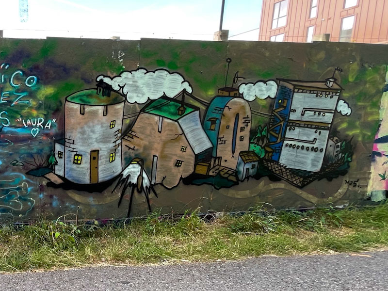
This urban landscape, making up the letters WHOS, is really imaginative, and coming from an artist more used to the free from of anti-style graffiti writing, is a great effort. The dark industrial colours lend themselves very well to the piece and help to create a special atmosphere, which would not have been achieved with bright pinks and yellows etc. I really hope that Whos is encouraged by this foray into a world of opportunities is just the beginning… we’ll have to wait and see.

Missed this piece and Conrico’s by a matter of minutes
Nice to see Whos getting up to something completely different . . .
LikeLiked by 2 people
Oh, that’s a shame. You snooze etc. Yes, it will be interesting to see if Whos tries another one like it.
LikeLiked by 2 people
For obvious reasons I am hoping he does . . .
LikeLiked by 2 people
Wow! This is so amazing and a very different atmosphere/perspective. Excellent.
LikeLiked by 2 people
If you saw his other stuff, you’d see just what a shift this is.
LikeLiked by 2 people
It’s not easy to change up styles. Very talented artist!
LikeLiked by 2 people