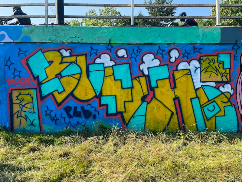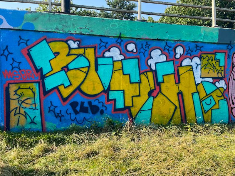
This is the third piece by Butch that I have posted, and although I can’t put my finger on exactly why, I really like what I see. There is a consistency to the letters from piece to piece, which means that the main focus is always likely to be on the fills and background.

This work by Butch, is on the cusp between casual throw up and a polished tight piece, which is an interesting space to inhabit, and I see that there is potential to create some high class finishing, but perhaps not the desire to go full-on high-end. The letters are composed of solid ‘plates’ of light blue and dusky yellow, riveted together, a device used by some artists, and a very effective one too. This is great work from the PLB graffiti writer.

Yeah that’s a nice piece
Trying to do what we do without transport is a complete nightmare if not physically impossible . . .
LikeLike
I’m finding it hard to fit trips in with work and shortening days!
LikeLiked by 1 person