
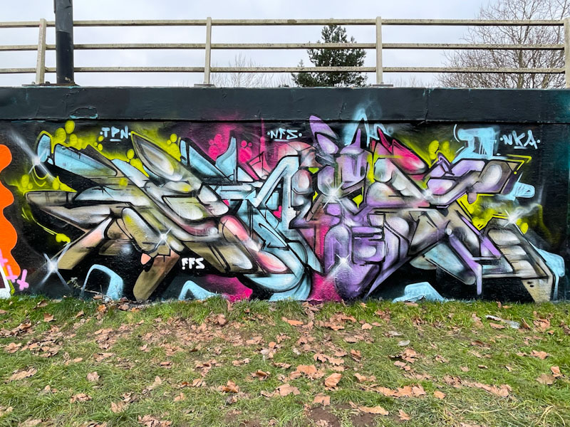
There is a clarity to Kid Krishna’s work at the moment which probably reflects his recently overhauled lifestyle, which is really good to see. The colours and design of this piece are outstanding and have a sense of purpose about them.
Although Kid Krishna conceals them well, the letters here spell CRIE, or that is what I have to believe, because that is what he told me all of his pieces spell. There is a wonderful structure to this piece, with each letter hosting a different colour regime, and being composed of ‘slabs’ or shapes. This is a tidy and sophisticated piece of graffiti writing.

It is very stylised
LikeLiked by 1 person
Completely so. In a style that is all his own.
LikeLiked by 1 person
Beautiful.
LikeLiked by 1 person