
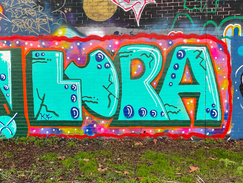
I have a feeling that this might be Lupa’s most sophisticated I have seen to date. Her familiar letters are given the solid fill treatment, with some decorative cracks. This is augmented with some circular patterns and accent lines placed in all the right places.

I have said it before that there is an authenticity to Lupa’s work that forgives the rough edges of her style. Big letters from a big personality, and something about her work that always makes me smile. Looking forward to loads more from Lupa in 2025.
