

This trio of pieces in the tunnel, show how busy Mr Klue has been of late in his favourite spot. The one on the left was painted a day or two before the other two, which I think might have been created in a single session.
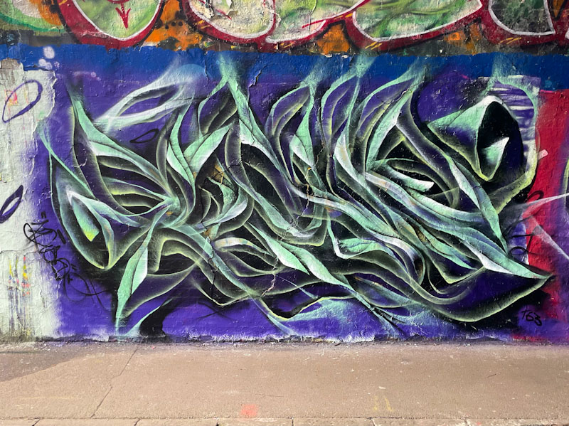
The left-hand piece, as with all of them, spells KLUE and has a green base palette. Ephemeral, smoky, abstract letters are part of the USP I would expect to see from Mr Klue and he rarely disappoints. There is little more to add from these three pieces, other than their colour differences.
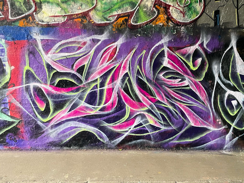
Pinks and purples dominate in this middle piece, with some yellow highlights along some edges.

Finally, the trio is rounded off on the right with a piece that is predominantly white, again with some yellow highlights. All three together show how Mr Klue’s abstract writing is based around the same simple concept, but can look completely different depending on the design details and colour palette. A busy man.

Indeed a busy man
I particularly like the recent piece at the other end of the tunnel . . .
LikeLiked by 1 person
He must be in good form at the moment, I know he dips from time to time.
LikeLiked by 1 person