
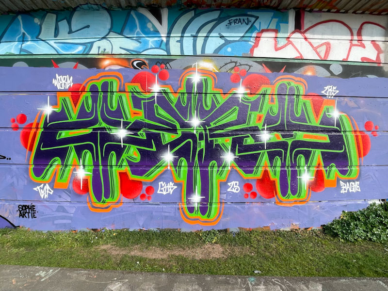
Werm is continuing along his journey, experimenting with bilateral symmetry in his writing. The symmetry in this one is notable, but I think that it might be the colour scheme that initially attracts the eye, with some nice contrasting reds, greens and oranges.
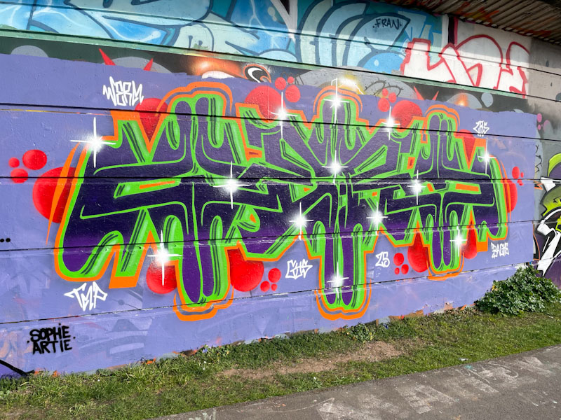
What baffles me about writers like Werm is how they manage to get everything ‘right’ if you know what I mean. For example, in this piece the green drop shadow veers off to the right, but it needs to be perfect across all the letters otherwise something would look out of kilter. I suppose the old adage, practice makes perfect, applies here, but it is still an admirable talent.
