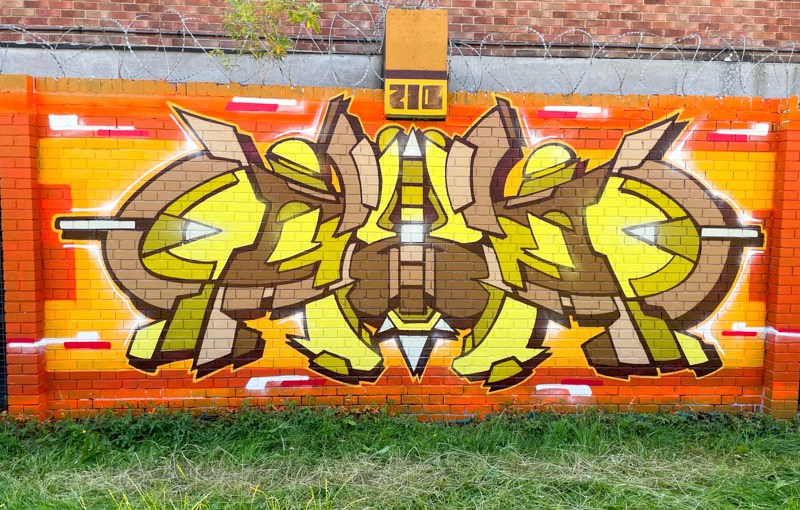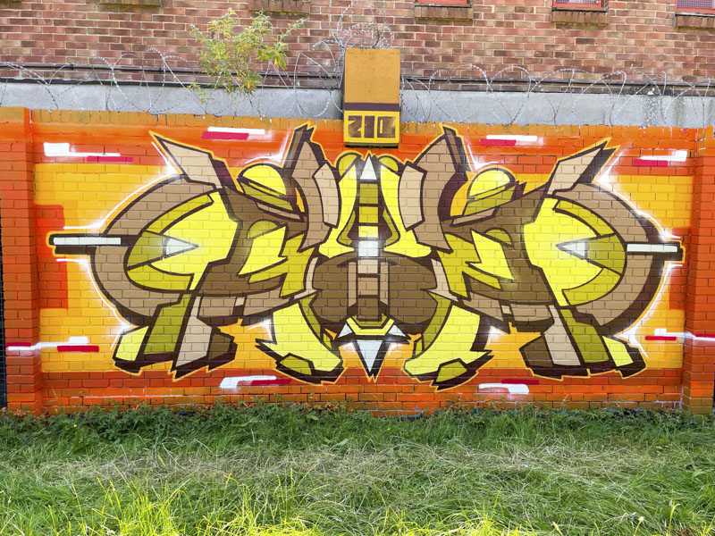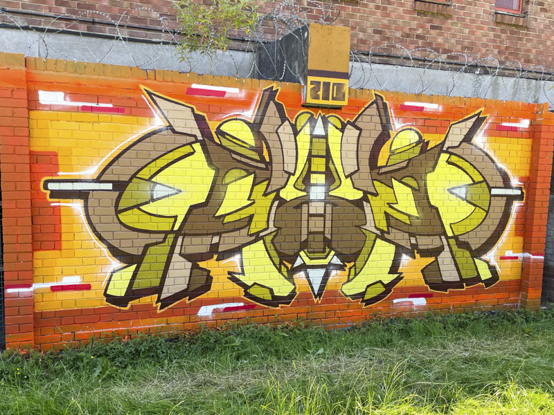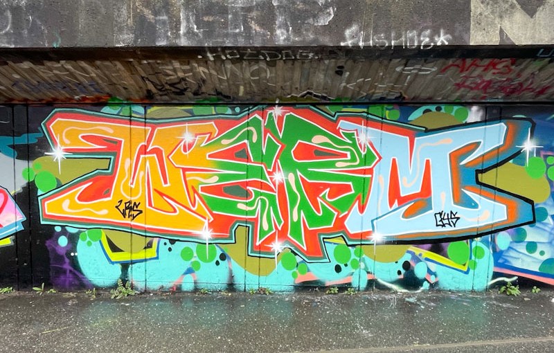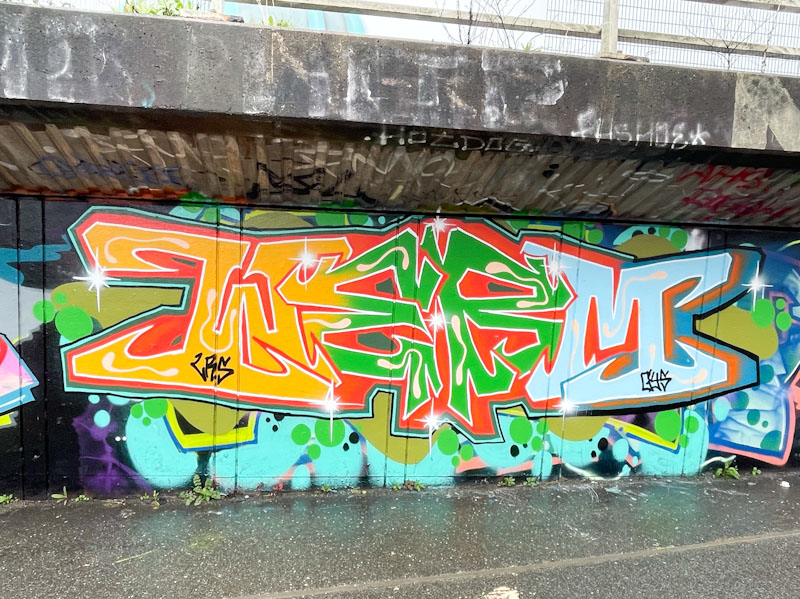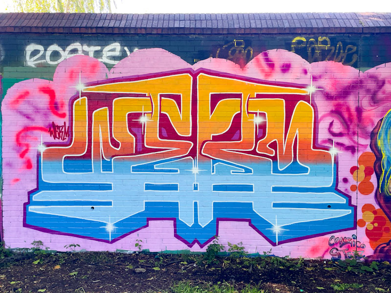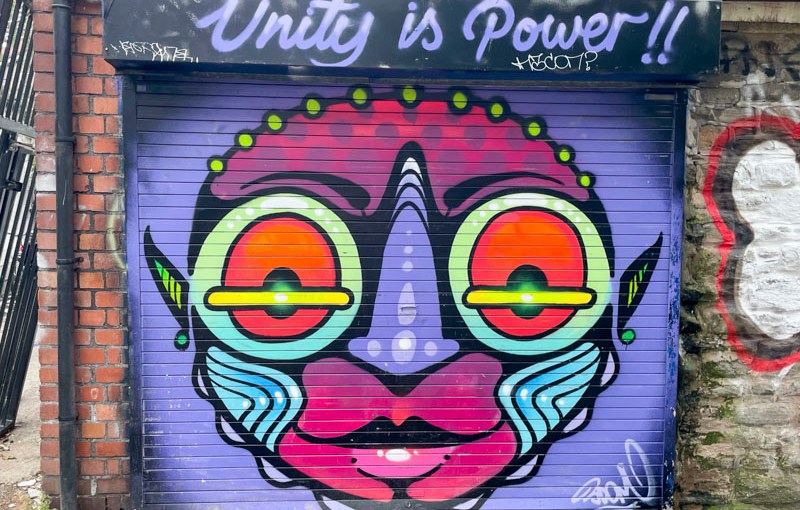
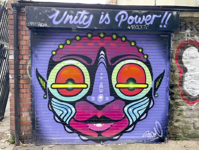
As you may know, I am accompanied by my long-suffering dog on most of my visits to graffiti spots in Bristol. It is a win-win scenario, where he gets a walk and I get to take photographs, it works well for both of us. On this occasion, he dragged me up an alleyway I don’t often choose to walk, and led me directly to this ‘street elf’ by 3Dom.
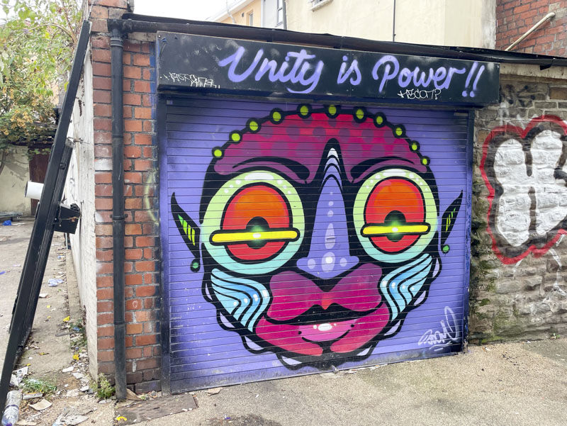
This series of stylised street elf portraits is a fabulous off-shoot from 3Dom’s more fantastical pieces, here showing discipline and symmetry, a world away from his surreal freestyle scenes. Unusually this elf is actually signed, perhaps the square format left enough space for a signature. Atop the piece the phrase ‘Unity is power’ stands proud. Still on the hunt for more of these characters by 3Dom.