
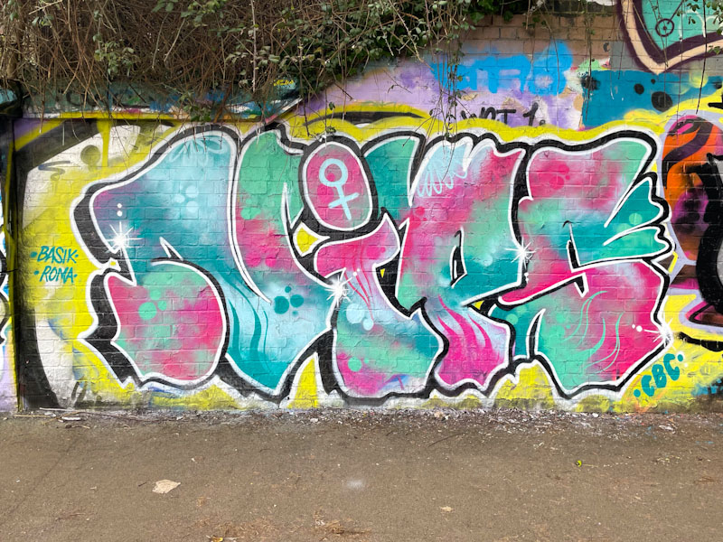
Aha! There is a certain consistency and reliability with Nips’ pieces that I am really attracted to. Her letters tend to be similar in shape from piece to piece, but it is in her fills where she really excels and shows off what she can do.
Set on a fairly elementary yellow backdrop, the letters NIPS are filled with a stunning patterned mix of pinks and blues, with some great designs and reversed out spots. The eye is drawn to the female symbol in the dot of the ‘i’, which is assertive and proud. Nips has included a couple of nice shout-outs to Basik and Roma too. I hope we see plenty more of Nips in 2025.
