

Now, regular readers will know that brown is my least favourite colour when it comes to graffiti writing, and it is a path I am unlikely to deviate from or be persuaded otherwise, so the selection of brown aside… this is a really nice tight piece by Werm.
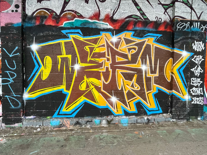
I rather like this letter style, which while keeping up the symmetry theme that Werm enjoys so much, also has something of a feel of Marvel or DC Comics about it, as if it should say ‘blam’ or ‘whack’ or something like that. Definitely a fun piece, well presented. Pity about the colour.
