
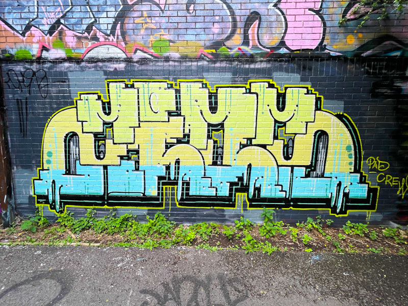
The name of the game in Trafficity’s work is consistency. His basic design of the letters ZIOS, with its near symmetry, hardly changes from piece to piece, with only the colours and peripheral decorations that vary. He must be able to paint this piece with his eyes shut.

There is a sharp contrast between the upper yellow section and light-blue lower section of the letters, perhaps amplified by the dark background. Not my favourite colour combination, but it seems to work well. I do sometimes wonder what Trafficity’s work would look like if he went for some different letters or new designs, but maybe it would disrupt the ‘brand’. Who knows?
